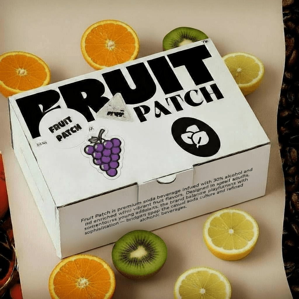
fruit patch
A soda beverage
product design : case study
Fruit Patch is a premium soda beverage infused with 30% alcohol and enriched with vibrant fruit flavors. Designed to appeal to adventurous young adults, the brand balances playfulness with sophistication — bridging the gap between casual soda culture and refined alcoholic beverages.
The market for alcoholic beverages is evolving. Today's young adult consumers seek products that are not only high-quality but also align with their lifestyle and aesthetic values. The brief was to develop Fruit Patch, a new premium alcoholic soda (30% ABV), from the ground up. The product needed to bridge the gap between casual, fun soda culture and the world of refined alcoholic beverages._
1. Introduction
fruit
patch
x
2.5x
2.5x
2.5x
2.5x
1.2 Logo and Wordmark

Project Brief
The market for alcoholic beverages is evolving. Today's young adult consumers seek products that are not only high-quality but also align with their lifestyle and aesthetic values. The brief was to develop Fruit Patch, a new premium alcoholic soda (30% ABV), from the ground up. The product needed to bridge the gap between casual, fun soda culture and the world of refined alcoholic beverages.
My Role: Brand Designer & Packaging Designer. My responsibility was twofold: first, to define the brand's strategic and visual soul (the 'why' and 'what'), and second, to translate that soul onto a physical, tangible product that would stand out on shelves and in hands (the 'how').
almost broken
grose
hey august
chillax
Display Typeface
Display Typeface
Display Typeface
Display Typeface
A B C D E F G H I
J K L M N O P Q R S
T U V W X Y Z
A B C D E F G H I
J K L M N O P Q R S
T U V W X Y Z
A B C D E F G H I
J K L M N O P Q R S
T U V W X Y Z
A B C D E F G H I
J K L M N O P Q R S
T U V W X Y Z
1 2 3 4 5 6 7 8 9 0
1 2 3 4 5 6 7 8 9 0
1 2 3 4 5 6 7 8 9 0
1 2 3 4 5 6 7 8 9 0

2.Typography: A Deliberate Duality
The typographic system was a critical tool for expressing the brand's dual personality. The specific fonts for the front and back of the can were chosen to serve very different, strategic goals.

2 .Typography: A Deliberate Duality
The typographic system was a critical tool for expressing the brand's dual personality. The specific fonts for the front and back of the can were chosen to serve very different, strategic goals.
Front-of-Can: Expressive & Contrasting
The typography on the front label is a direct reflection of the "Sophisticated Fun" strategy.
The Serif (Almost Broken): For the primary flavor name, I selected Almost Broken. Its bold, high-contrast letterforms provide a strong, sophisticated anchor for the design. The font has a modern, fashion-forward edge that feels premium and established.
The Script (Hey August): Paired with this is Hey August, a friendly and organic script font used for the sub-flavor. This choice provides a perfect counterbalance to the formal serif, injecting the "fun," personal, and human spirit of the brand.
This intentional pairing of the elegant Almost Broken with the playful Hey August creates a dynamic tension that is central to the brand's identity—it's refined but not rigid, playful but not childish.
Back-of-Can: Functional & Clear
While the front is for expression, the back is for communication. The typographic approach here prioritized clarity and legibility.
The Sans-Serif System (Chillax & Grose): To build a clear information hierarchy, I used a combination of two highly functional sans-serif fonts. For headings, I used Chillax in a bold weight to create clear entry points for the reader. For the main body text, the grotesque-style font Grose was chosen for its exceptional readability at small sizes, ensuring all essential product information is clear, accessible, and compliant. This no-nonsense approach ensures the brand feels professional and trustworthy.

1.The Visual Identity System
The identity needed to embody this duality.
The Wordmark: I selected a high-contrast serif typeface for the "Fruit Patch" name. This immediately communicates a sense of premium quality and sophistication.
The Logo: To represent the natural fruit flavors and add a modern touch, I designed a clean, geometric leaf icon. This mark acts as a versatile seal of quality.
Focus on Information Hierarchy: We successfully organized a large amount of complex data in a digestible format, ensuring important figures are prominent and the interface remains clean.
Intuitive & User-Centric Workflow: We designed the journey from market analysis to trade execution to be logical and seamless, with thoughtfully integrated tools.
2.Typography
3.1 Packaging and design
Part 2: The Packaging Designer — Bringing the Brand to Life
With the brand strategy and identity system in place, my role shifted to that of a packaging designer. The challenge was to apply this 2D system to a 3D object in a way that was compelling, functional, and created a memorable user experience.

2.1.Packaging View
Fruit Patch is a premium soda beverage infused with 30% alcohol and enriched with vibrant fruit flavors. Designed to appeal to adventurous young adults, the brand balances playfulness with sophistication — bridging the gap between casual soda culture and refined alcoholic beverages.

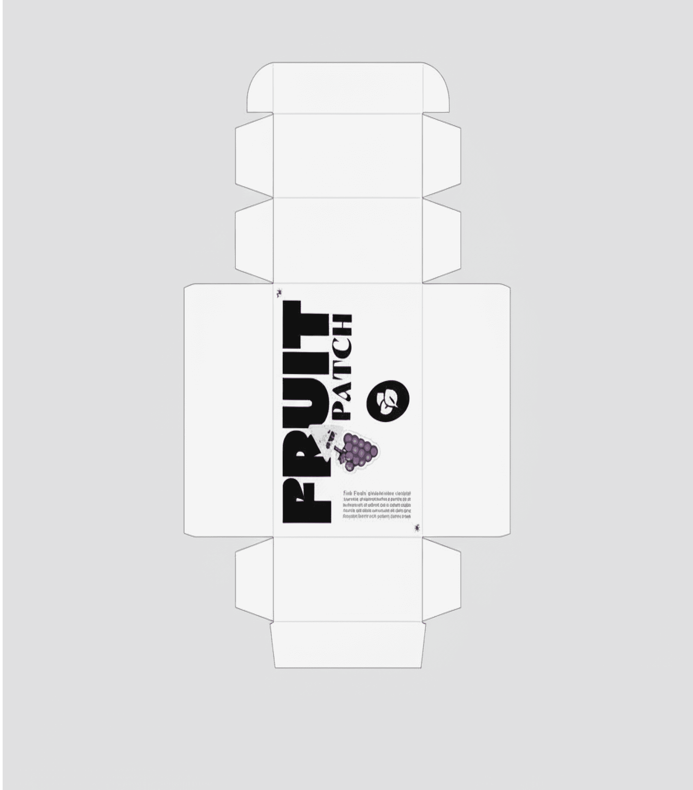
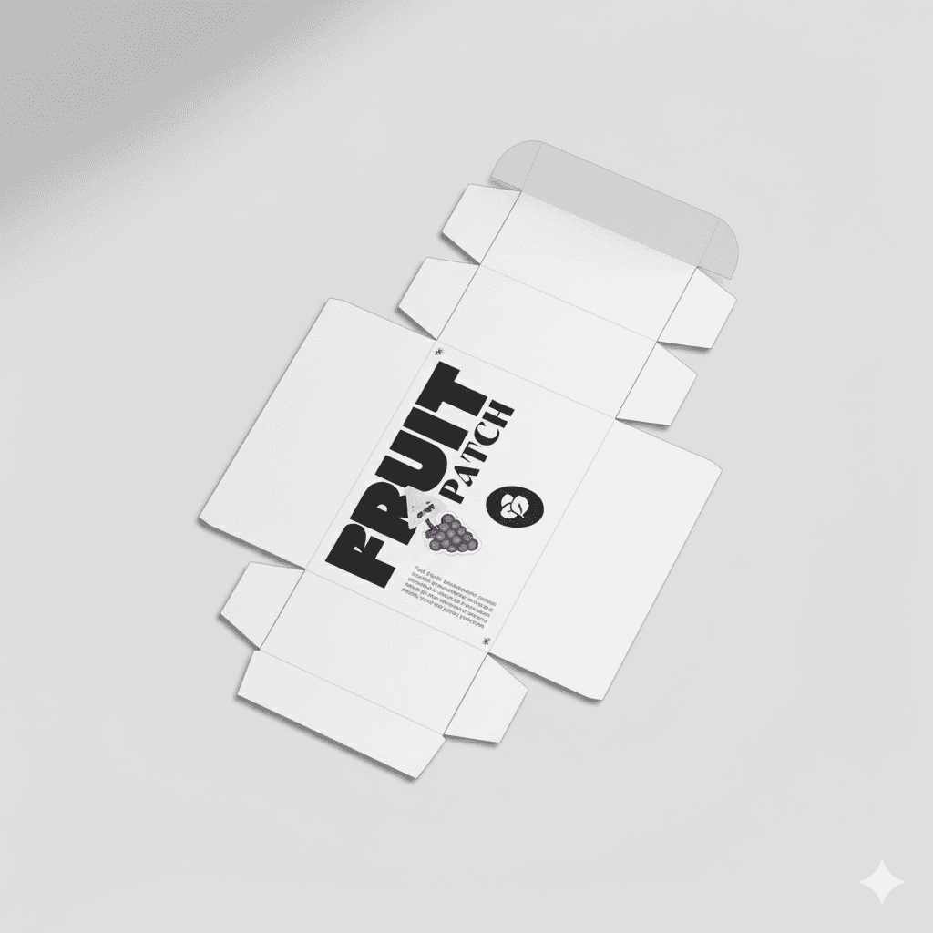
3.2.The Secondary Packaging: The Box
The unboxing process is a critical part of the modern consumer journey.
Structural Design: I started with a standard die-line for a cuboid box, ensuring it was structurally sound and easy to assemble.
A Deliberate Contrast: I made a conscious choice to keep the exterior of the box minimalist and monochrome. This serves a strategic purpose: it leverages the power of contrast. The sophisticated, understated exterior builds a sense of anticipation for the vibrant, colorful cans hidden within.
The Reveal: This "reveal" transforms a simple purchase into an experience. The starkness of the box, focused purely on the core wordmark and logo, reinforces the brand's premium positioning before the customer even touches the product itself.

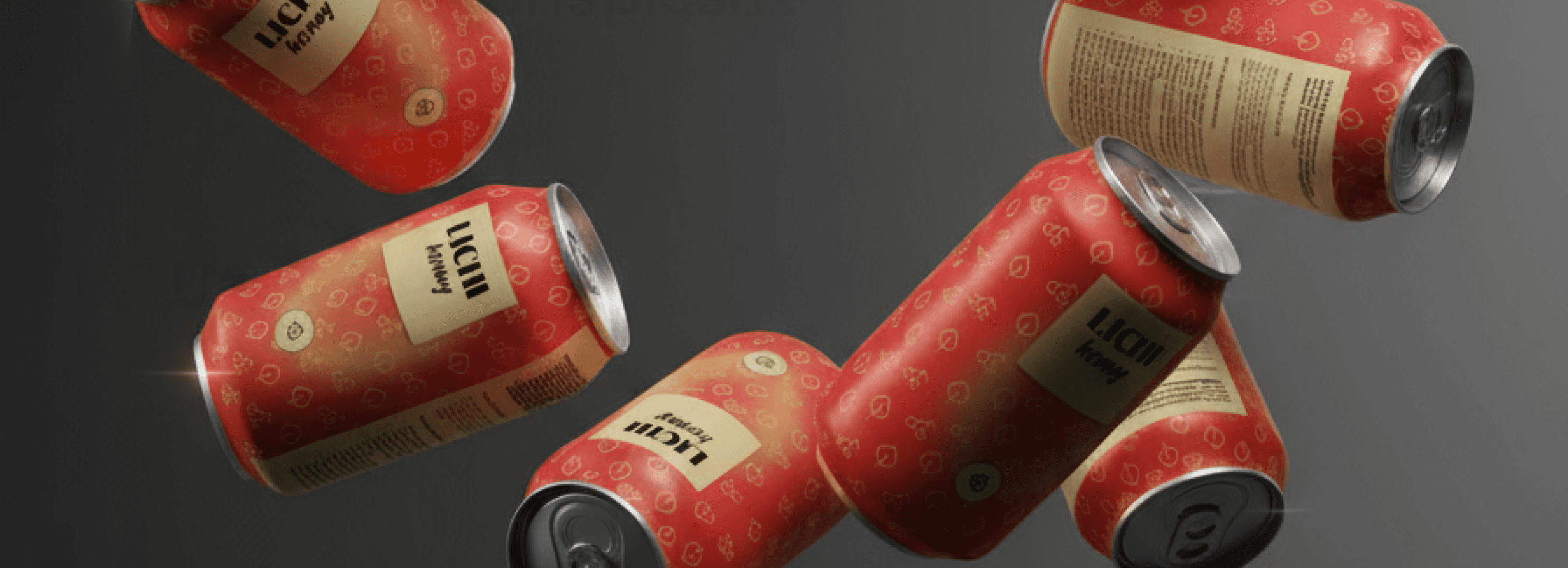
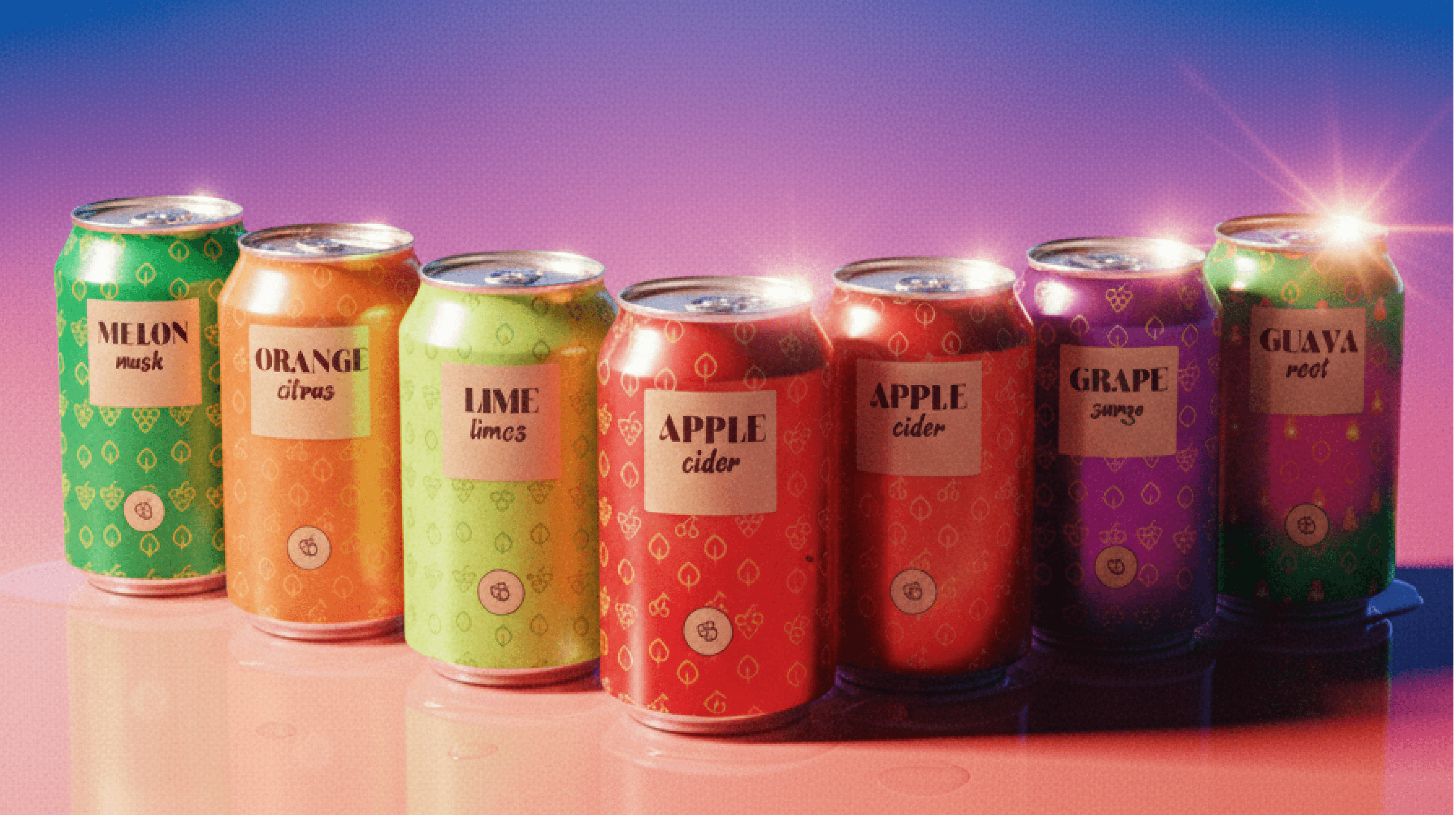
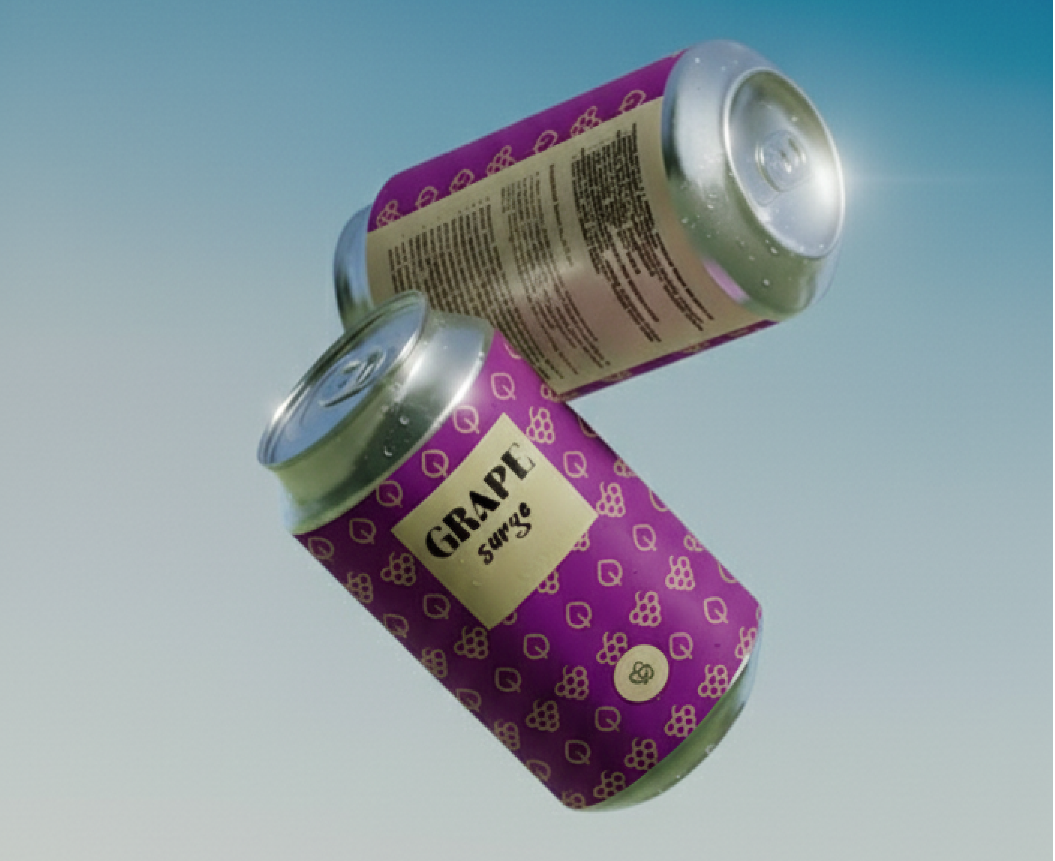
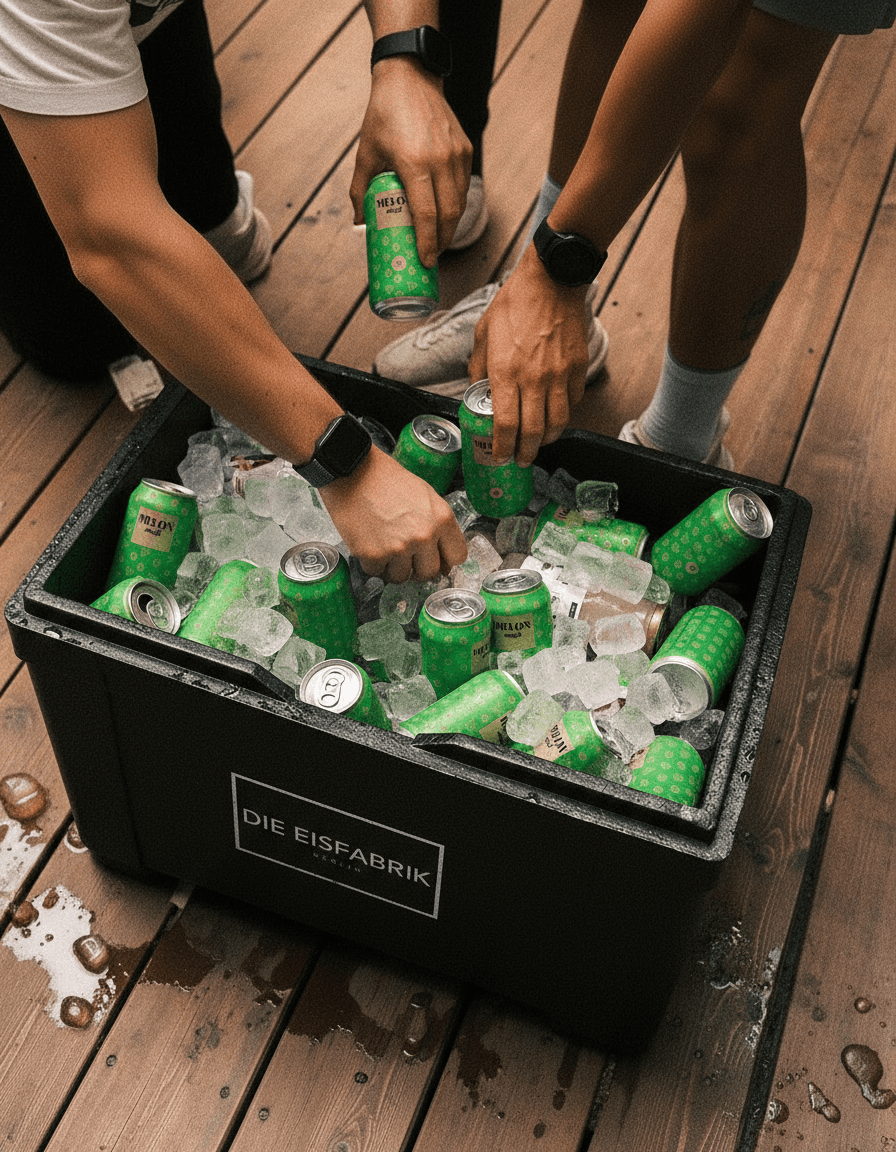
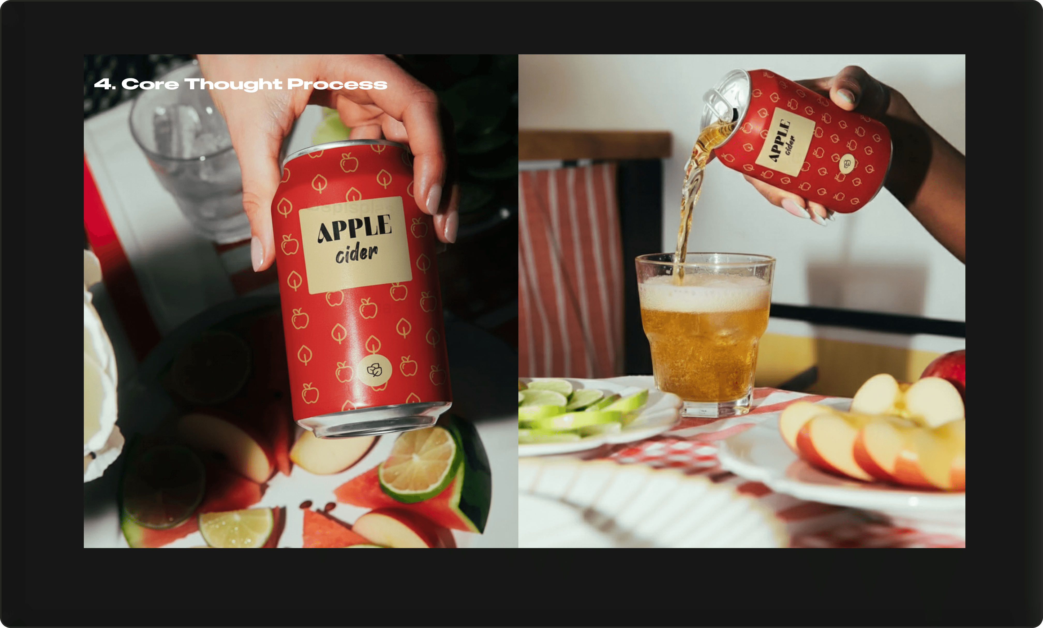
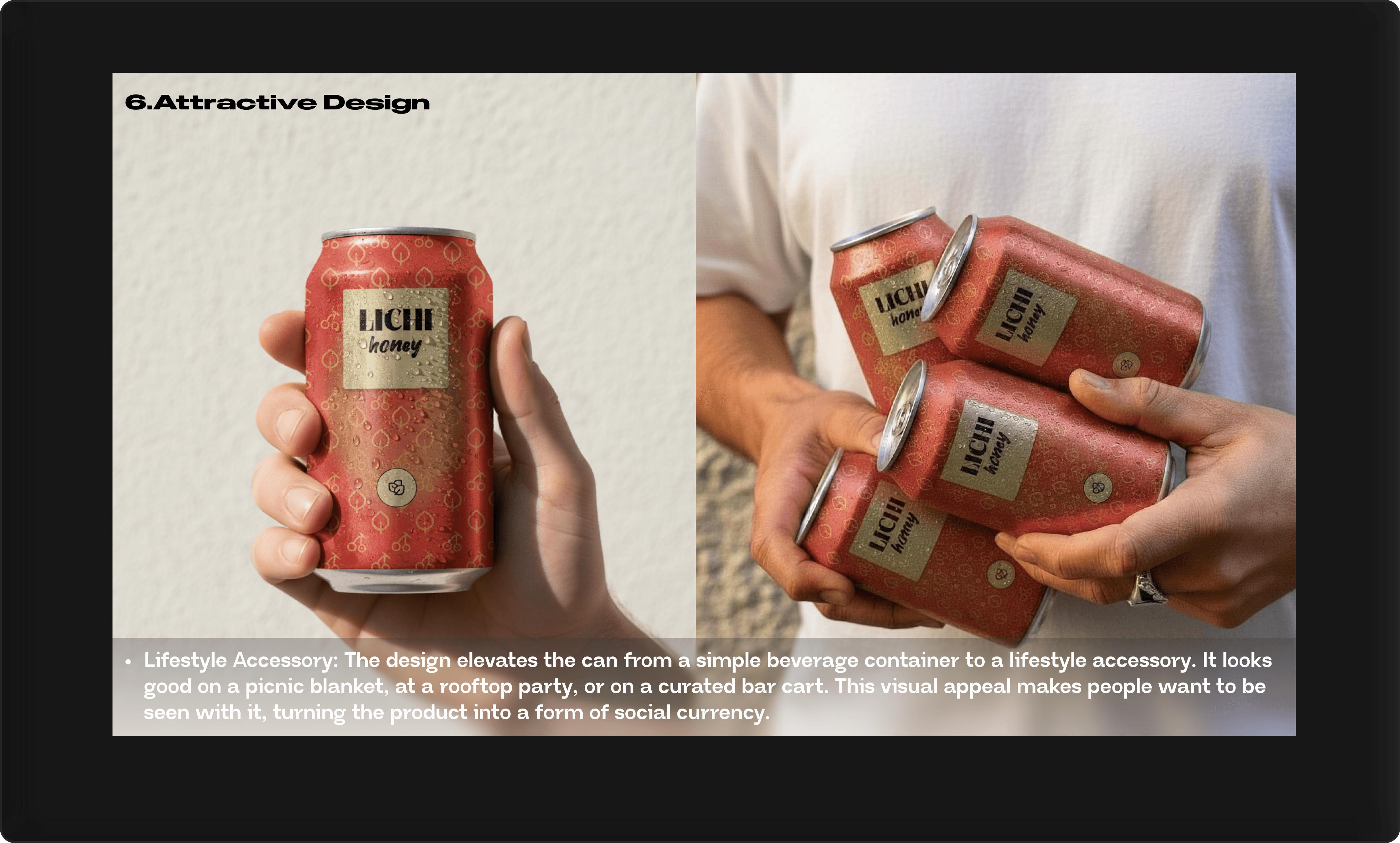
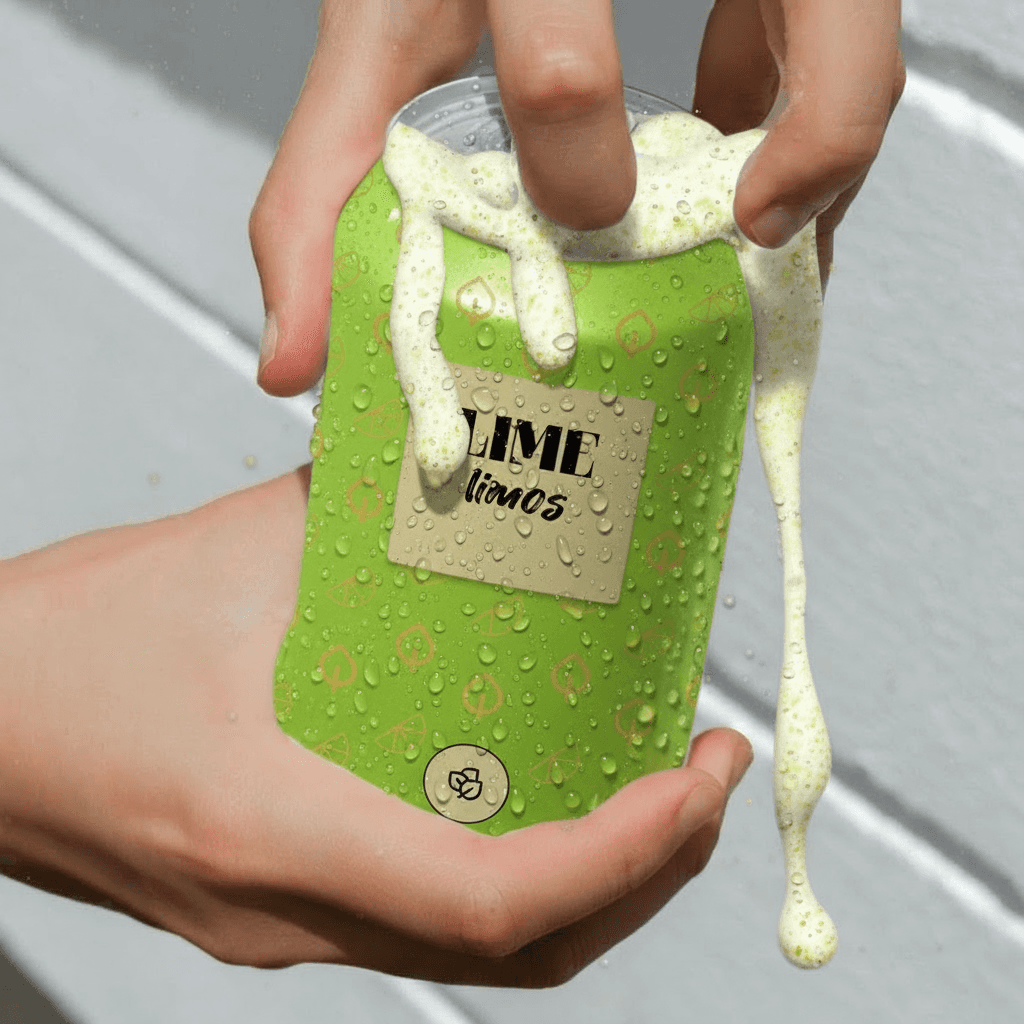
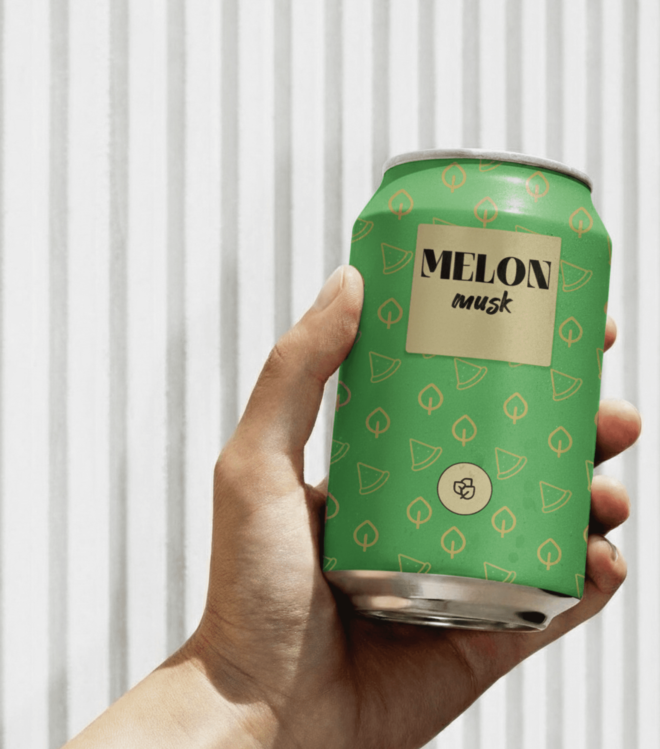
3.1.The Primary Packaging: The Can
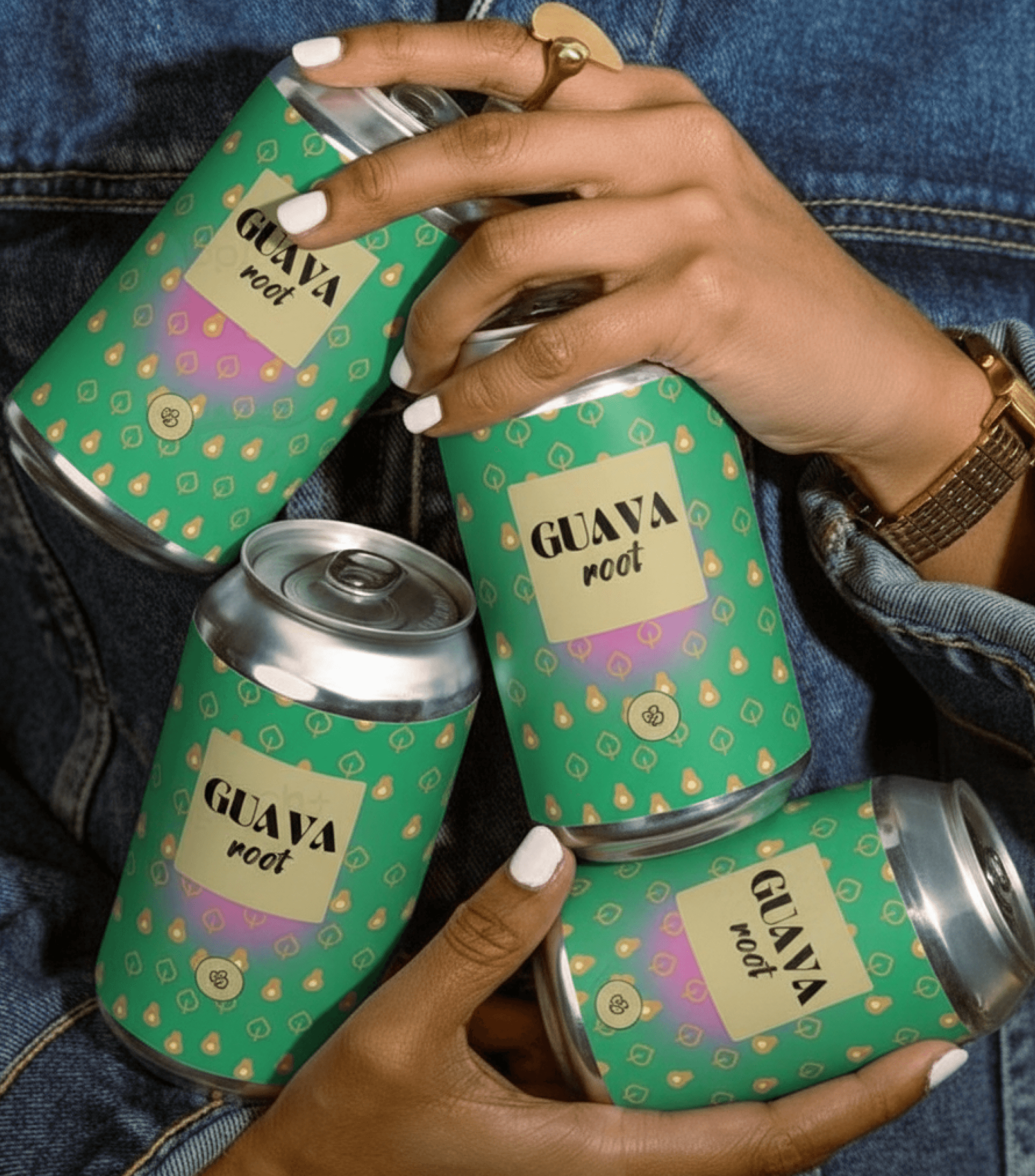
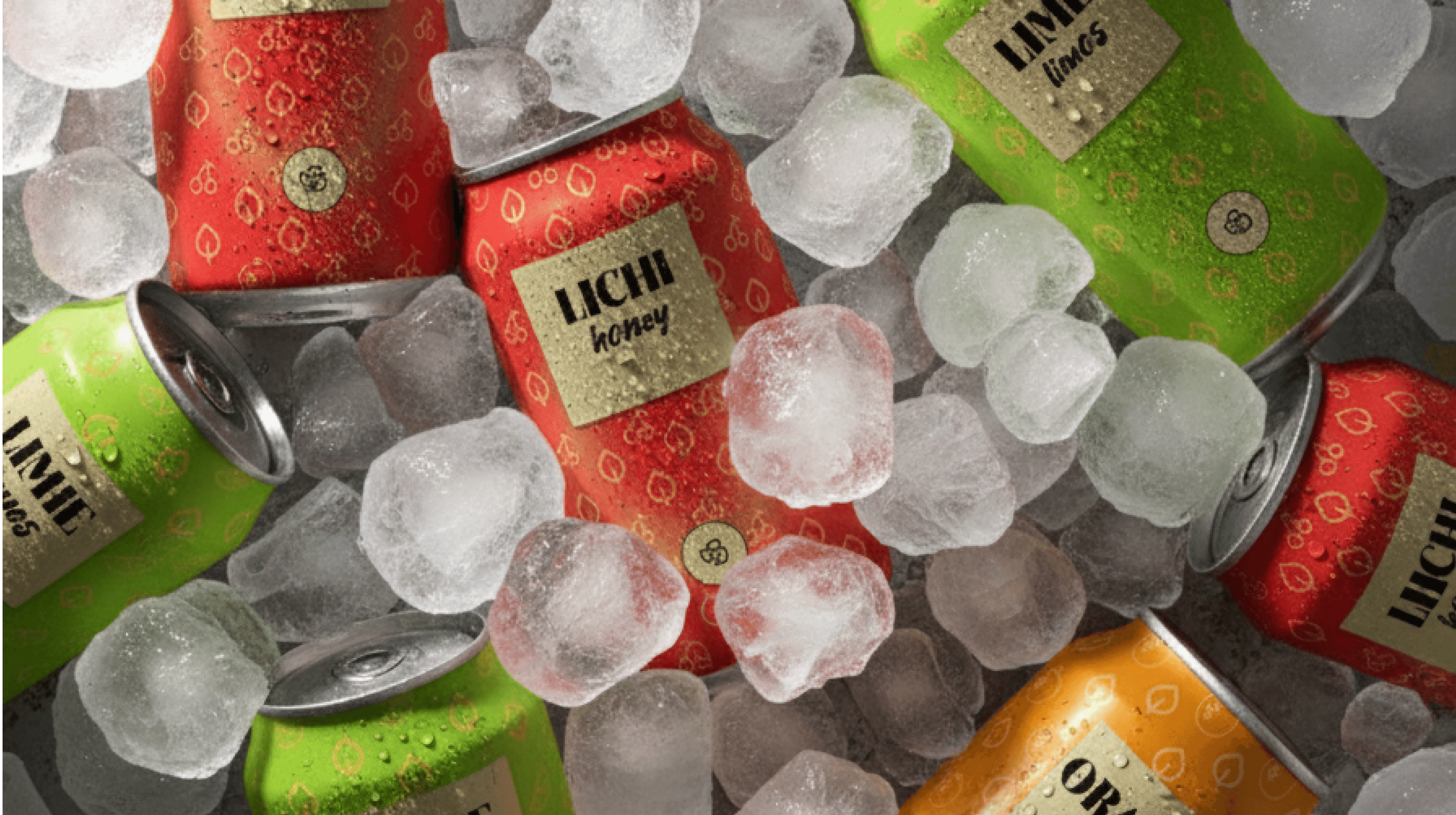
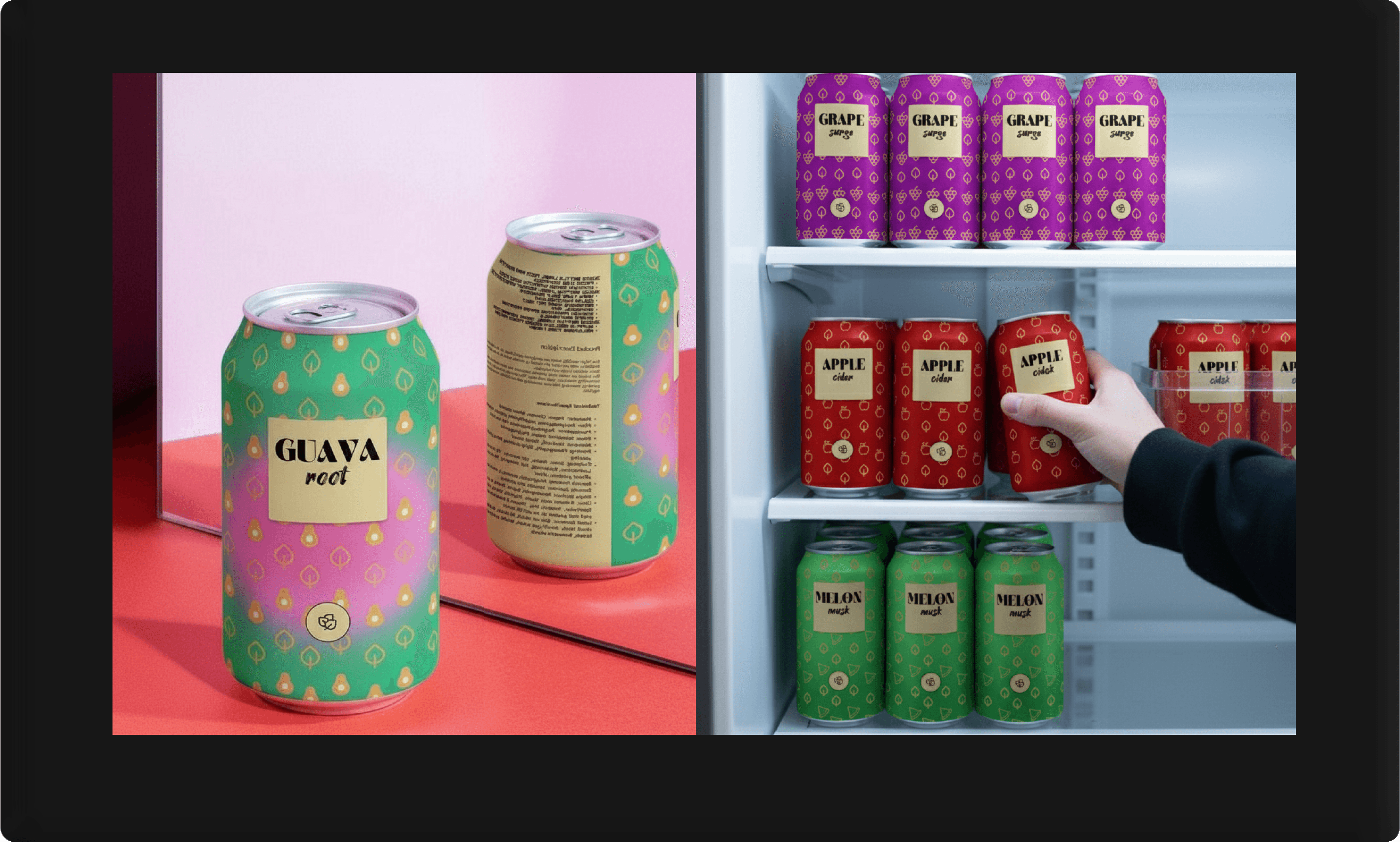
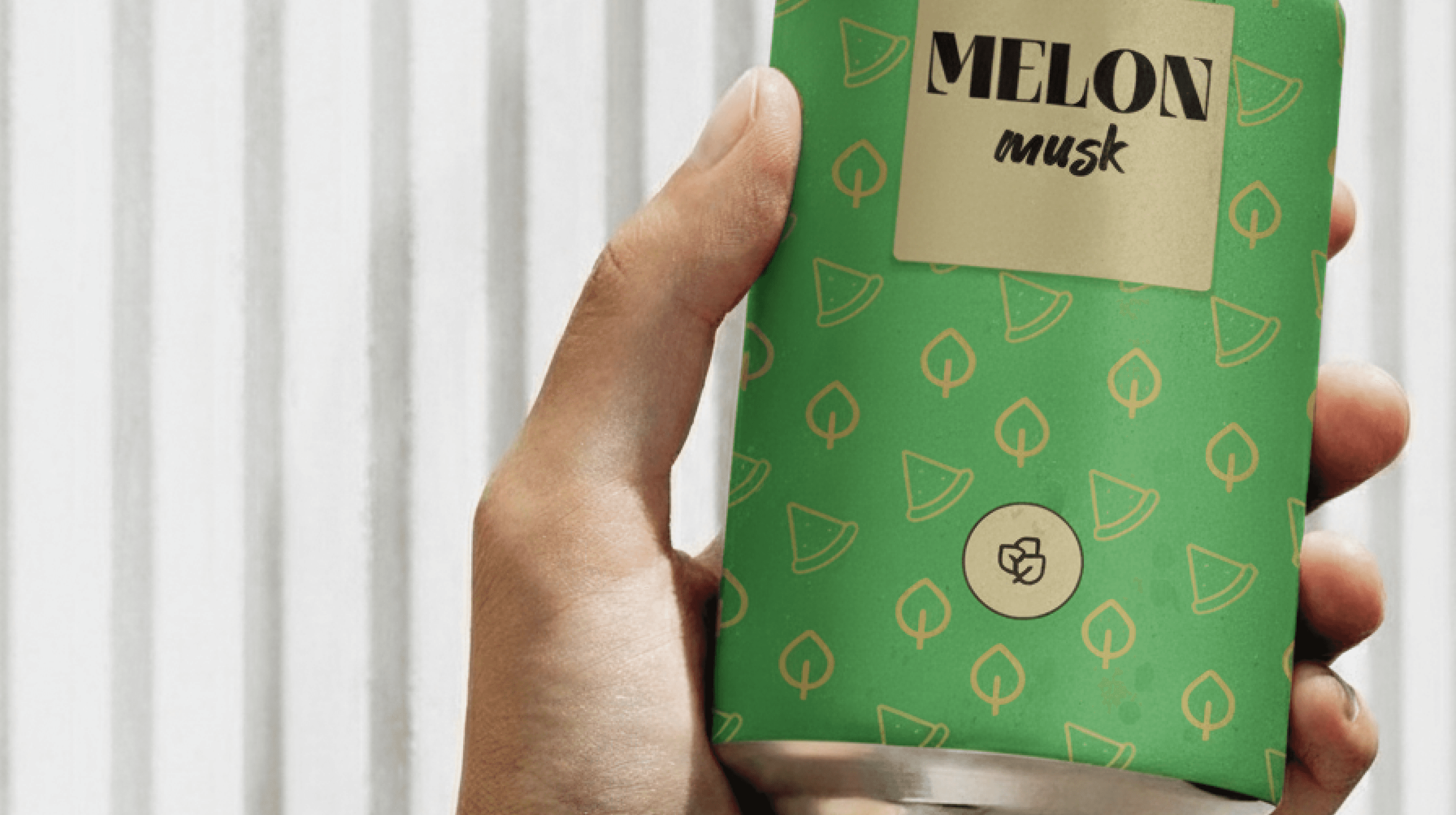
The can is the primary interaction a customer has with Fruit Patch. The design had to be impactful from every angle.
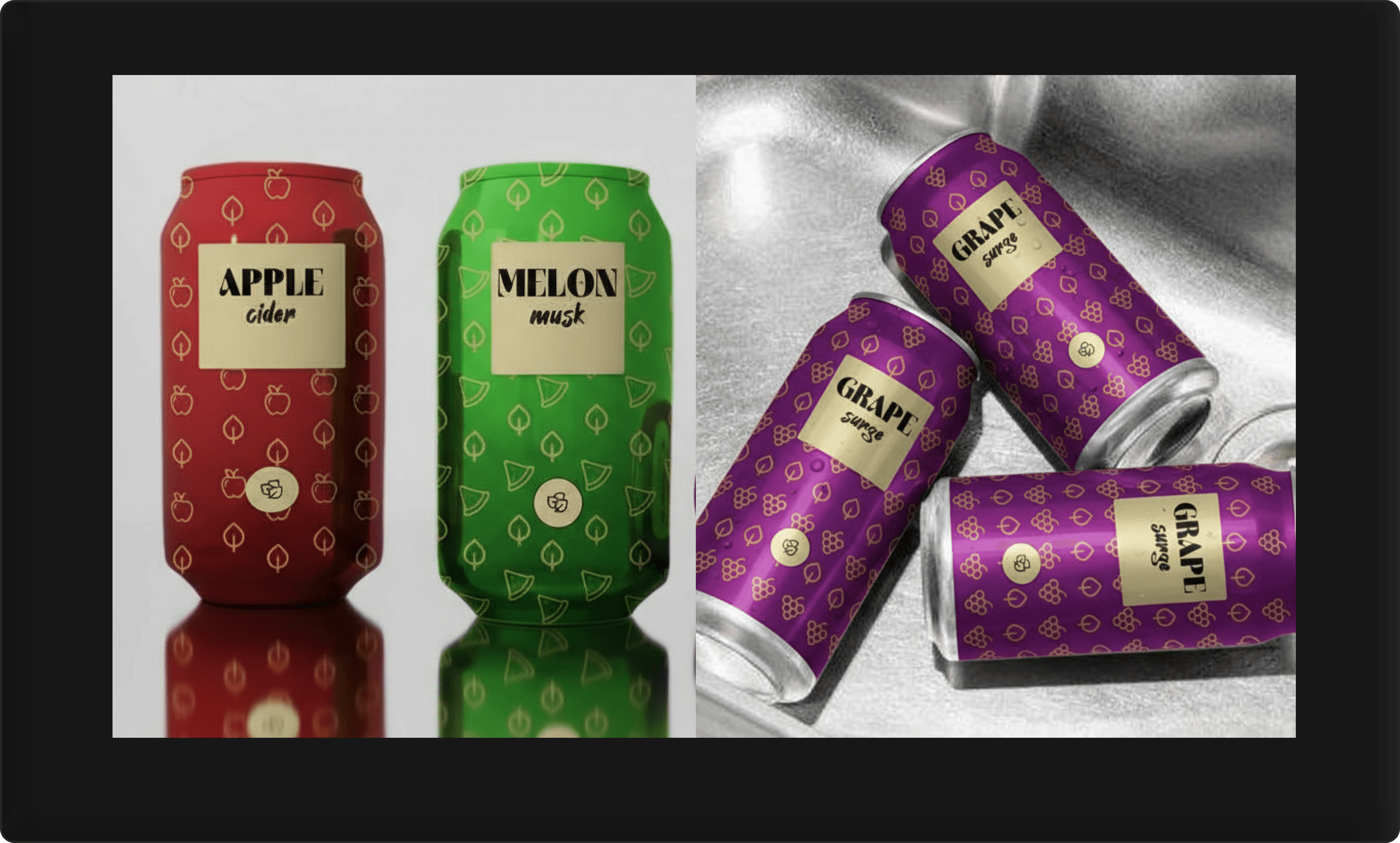
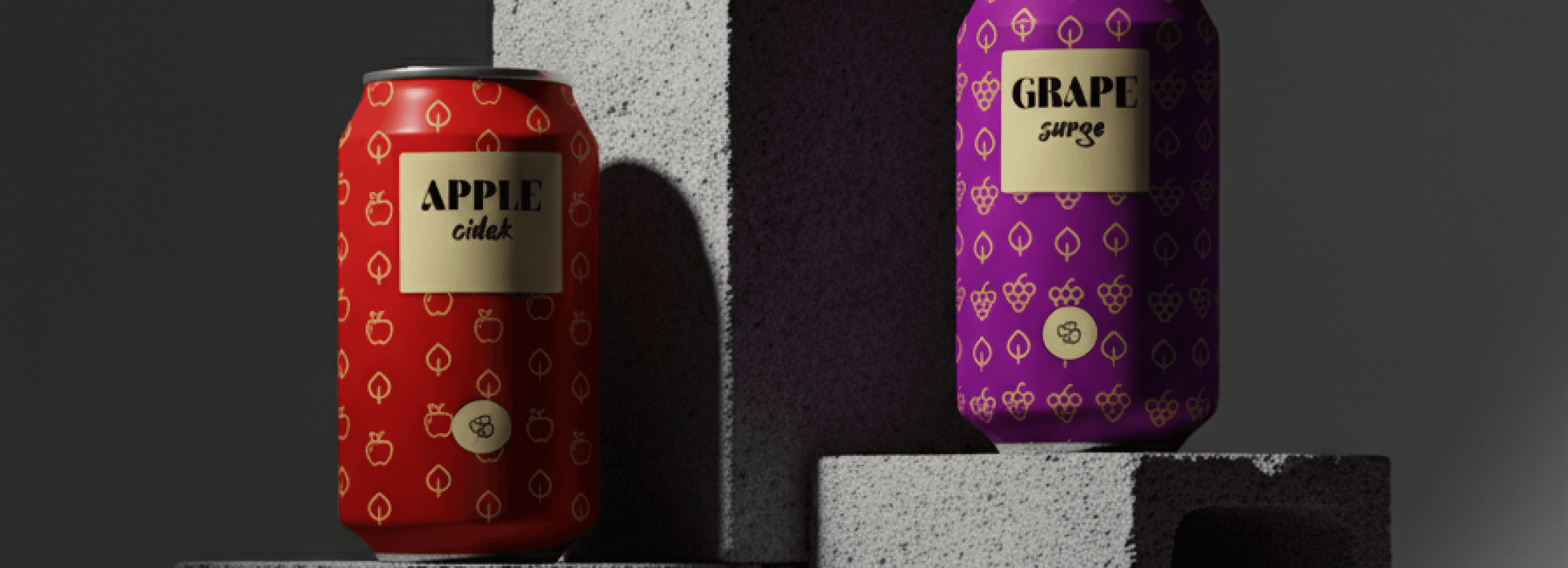
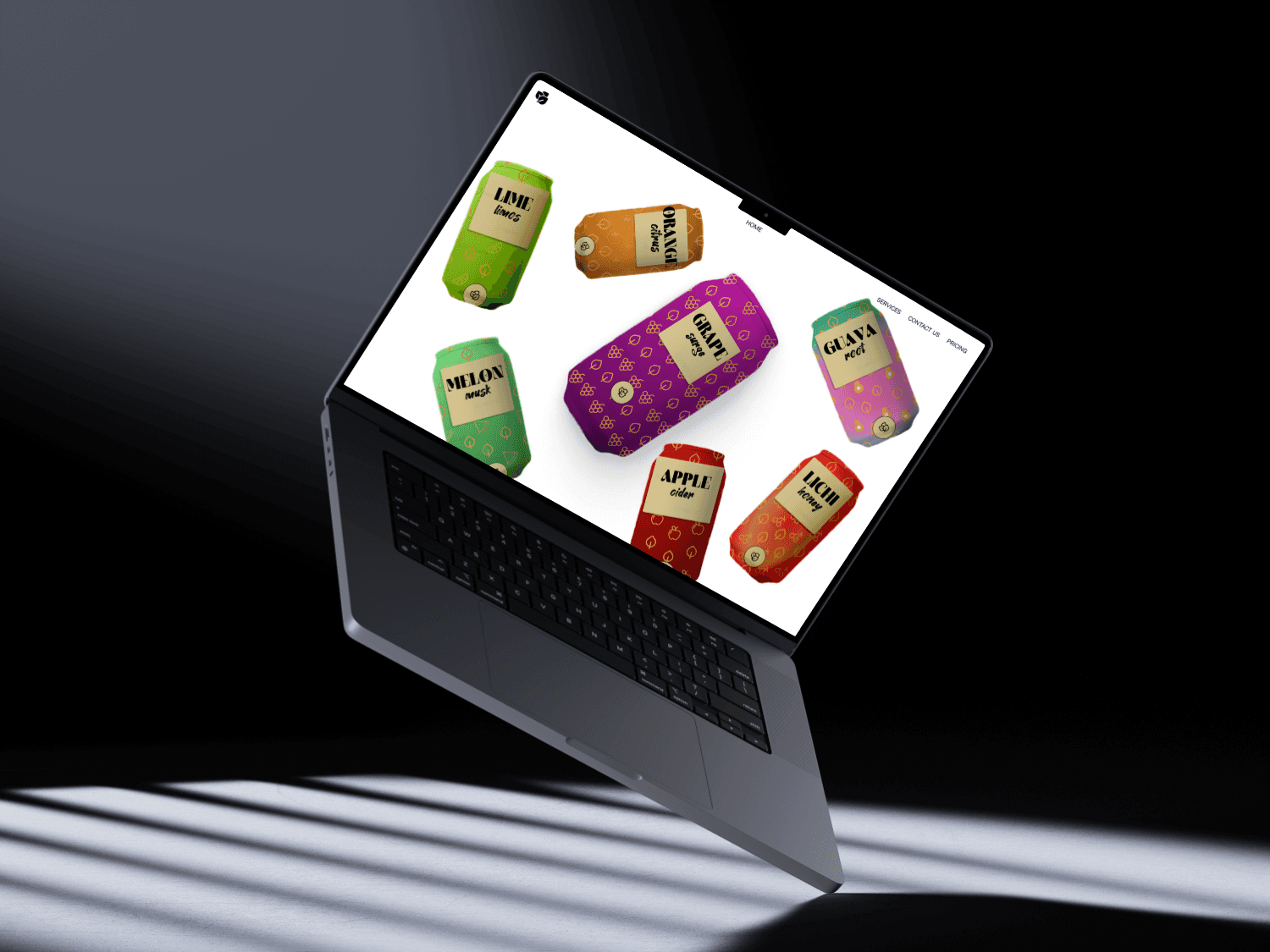
Materiality and Finish: The central label was conceived as a simulated gold foil. This choice of finish provides a tactile and visual point of luxury that contrasts beautifully with the matte, colorful background, reinforcing the premium nature of the product.
360° Experience: I developed a system of repeating, flavor-specific patterns to wrap around the entire can. This ensures the product is visually engaging from any direction and creates a strong, energetic shelf presence when products are placed side-by-side. The patterns are the "fun" element, making the can feel vibrant and alive.
Information Architecture: From a packaging perspective, clarity is key. The gold label provides a clean, legible space for the flavor name, while the back was carefully designed to house all necessary product information without disrupting the aesthetic flow of the pattern.


8.Conclusion: A Unified Experience
As both the brand and packaging designer, my goal was to ensure a seamless translation from abstract idea to physical product. The success of Fruit Patch lies in this unity. The strategic decision to blend "sophistication" and "fun" is not just an idea; it's physically present in every aspect of the design. The final result is a product that looks, feels, and communicates its unique brand story from every possible angle, positioning it to capture the hearts and minds of a new generation of consumers.
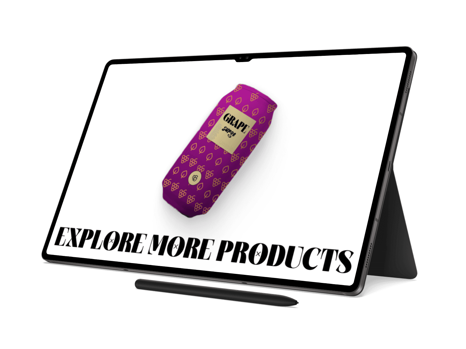
fruit patch
A Fresh E-commerce Experience
website UI design : case study
Fruit Patch is a premium soda beverage infused with 30% alcohol and enriched with vibrant fruit flavors. Designed to appeal to adventurous young adults, the brand balances playfulness with sophistication — bridging the gap between casual soda culture and refined alcoholic beverages.
Built-in Aesthetics: The vibrant colors, unique patterns, and overall high-end feel of the cans make them inherently "Instagrammable." They are designed to be photogenic and stand out in a crowded social media feed. This encourages user-generated content (UGC), where customers essentially become brand ambassadors by posting photos of the product.

6.How the Design Attracts Young Adults
The design is specifically engineered to resonate with a modern youth audience.
High "Shareability": The vibrant, colorful cans are inherently photogenic. The distinct patterns and aesthetic appeal make them highly "Instagrammable," turning the product itself into a shareable social object and a vehicle for organic marketing.
Authentic Complexity: The blend of different design styles feels more authentic and multi-faceted, mirroring the diverse tastes of a generation that resists being put into a single box.
Trust Through Quality Cues: While the colors and patterns attract the eye, the sophisticated typography, clean logo, and considered packaging assure the customer they are purchasing a high-quality, premium product. This builds trust and justifies its position as a refined alcoholic beverage.
The Element of Surprise: The stark, minimalist design of the outer box creates a moment of anticipation. The consumer knows something vibrant is inside, and the contrast between the understated exterior and the colorful interior creates a satisfying "reveal."
A Multi-Faceted Personality: The brand doesn't just scream "FUN!" or whisper "PREMIUM." The combination of the elegant, high-fashion serif font (Almost Broken) with the personal, organic script (Hey August) gives the brand a more authentic, multi-faceted personality. It feels like a brand with depth and different moods.
A Multi-Faceted Personality: The brand doesn't just scream "FUN!" or whisper "PREMIUM." The combination of the elegant, high-fashion serif font (Almost Broken) with the personal, organic script (Hey August) gives the brand a more authentic, multi-faceted personality. It feels like a brand with depth and different moods.
key Design strenghts

7.Key Design Strengths & Competitive Advantage
A Unique Visual Position: Unlike competitors who are either fully committed to a chaotic, "fun" aesthetic or a stark, ultra-minimalist one, Fruit Patch carves its own niche. This visual duality is its greatest strength, making it instantly recognizable and allowing it to appeal to a broader segment of the youth market.
A Scalable System: The brand isn't a one-off design; it's a robust and flexible system. The combination of color-coding, unique patterns, and a consistent label structure means new flavors can be introduced seamlessly and affordably, without ever diluting the core brand identity.
The Memorable Unboxing Ritual: The secondary packaging isn't an afterthought. The contrast between the box and the cans creates a memorable unboxing experience, a tactile ritual that adds perceived value and encourages social sharing—a detail many competitors overlook.

Project Overview
Project: Fruit Patch E-commerce Website Design
My Role: Lead UI/UX Designer, Interaction Designer
Timeline: 1.5 Weeks (Conceptual Project)
Objective: To design a vibrant, engaging, and immersive digital storefront for "Fruit Patch," a conceptual brand of premium fruit juices. The goal was to move beyond a standard e-commerce grid and create a memorable brand experience that encourages product exploration and drives conversions.

This case study provides a comprehensive UI/UX analysis of the "Tradex" mobile trading application, based on a series of provided screenshots. The objective is to evaluate the app's design, usability, and overall user experience from the perspective of both novice and experienced traders. The analysis will cover user flow, visual design, feature implementation, and identify key strengths and potential areas for improvement.
1. Introduction
1. The Immersive Hero Section & Introduction

The Challenge
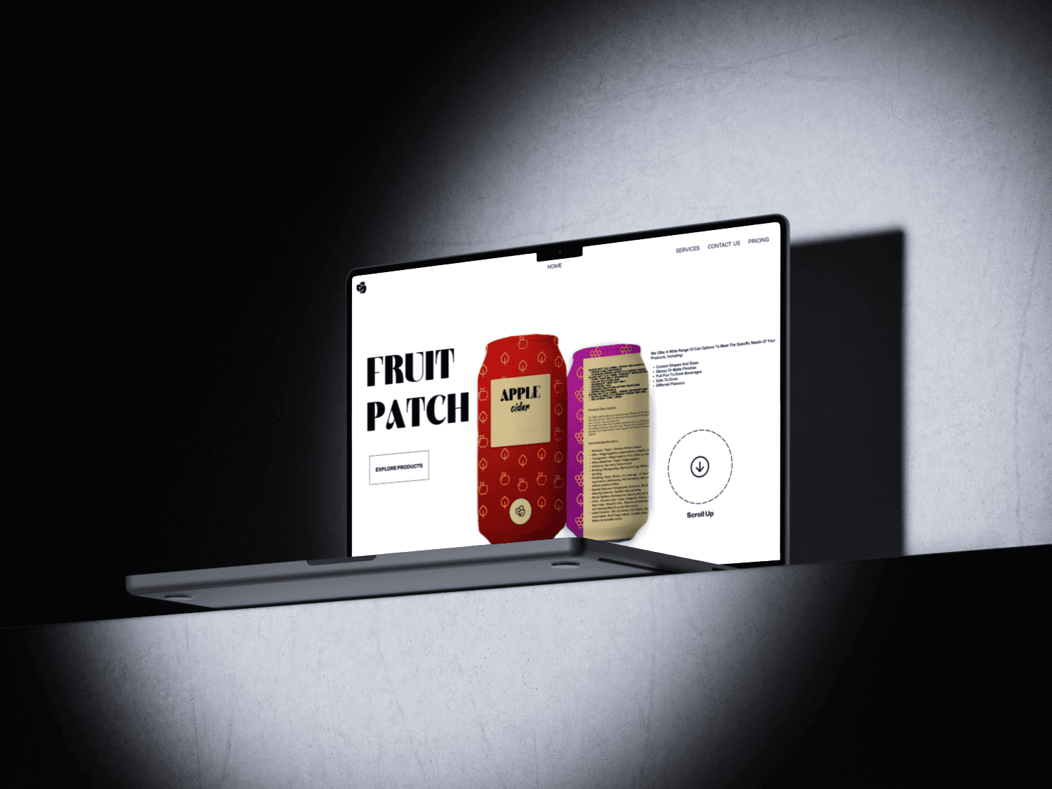
The online beverage market is saturated. For a new brand like Fruit Patch to succeed, its website cannot simply be a functional store; it must be an extension of the product itself—fresh, vibrant, and full of flavor. The primary challenge was to translate the brand's energetic and natural identity into a digital experience that would capture users' attention, tell a compelling story, and guide them seamlessly from discovery to purchase.
The Vision: "Scrollytelling" a Flavorful Journey
My core vision was to create an interactive journey using "scrollytelling"—where the act of scrolling unfolds the brand's narrative and showcases the products in a dynamic, cinematic way. I wanted users to feel like they were discovering each flavor, not just browsing a catalog. The design needed to be clean and modern, allowing the colorful and playful product packaging to be the hero of the experience.
3. User Experience & Feature Analysis

3.An Unconventional Product Gallery
The goal here was to transform a typically transactional part of an e-commerce site into an engaging, brand-aligned experience.
Encouraging Discovery over Analysis: This layout encourages a different mode of browsing. Instead of systematically scanning rows and columns, the user's eye is invited to wander and land on whatever catches their attention. This promotes a more serendipitous discovery process. Microinteractions, such as a can subtly enlarging or tilting on hover, would provide immediate feedback, making the interface feel tactile and responsive, further encouraging clicks.
Reducing Decision Fatigue: While it seems counterintuitive, this less rigid structure can reduce the cognitive load associated with choice. By making the browsing experience itself enjoyable and game-like, the user is more relaxed and open to exploring products they might have otherwise scrolled past in a conventional grid.

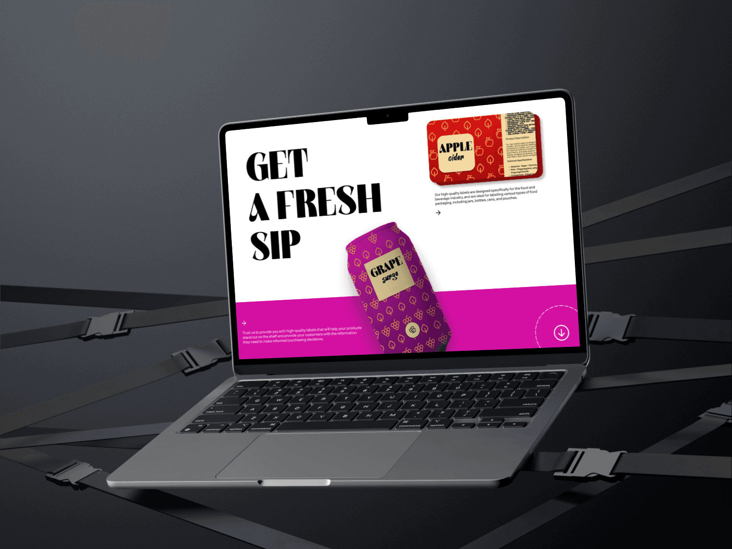
Choreographing the User Journey: The animations are carefully choreographed to create a narrative flow. The sequence guides the user logically: from brand introduction (Hero) to a taste of the products (First Cans), to the brand's core message ("GET A FRESH SIP"), and finally to a full exploration of the product line. Each scroll builds upon the last, making the journey feel cohesive and intentional. Techniques like parallax scrolling (where background and foreground elements move at different speeds) add depth and a sense of three-dimensionality to the 2D screen.
Pacing, Easing, and Perceived Quality: The quality of the motion is critical. The animations utilize "ease-in-out" timing functions, meaning they start slowly, accelerate, and then decelerate smoothly. This organic movement feels natural and polished, avoiding the abrupt, jarring transitions that can make a site feel cheap. The pacing is timed to match a natural scrolling speed, ensuring the user feels in control and the site feels responsive, not sluggish.
Purposeful Engagement: Every animation serves a purpose. The background color wipe transitions serve to clearly delineate sections, acting as a visual reset. The rotation of the cans as they appear draws attention to the 360-degree product design. The fading-in of text ensures that the user's focus is on the visuals first, then on the supporting information, mirroring how we naturally process our environment.

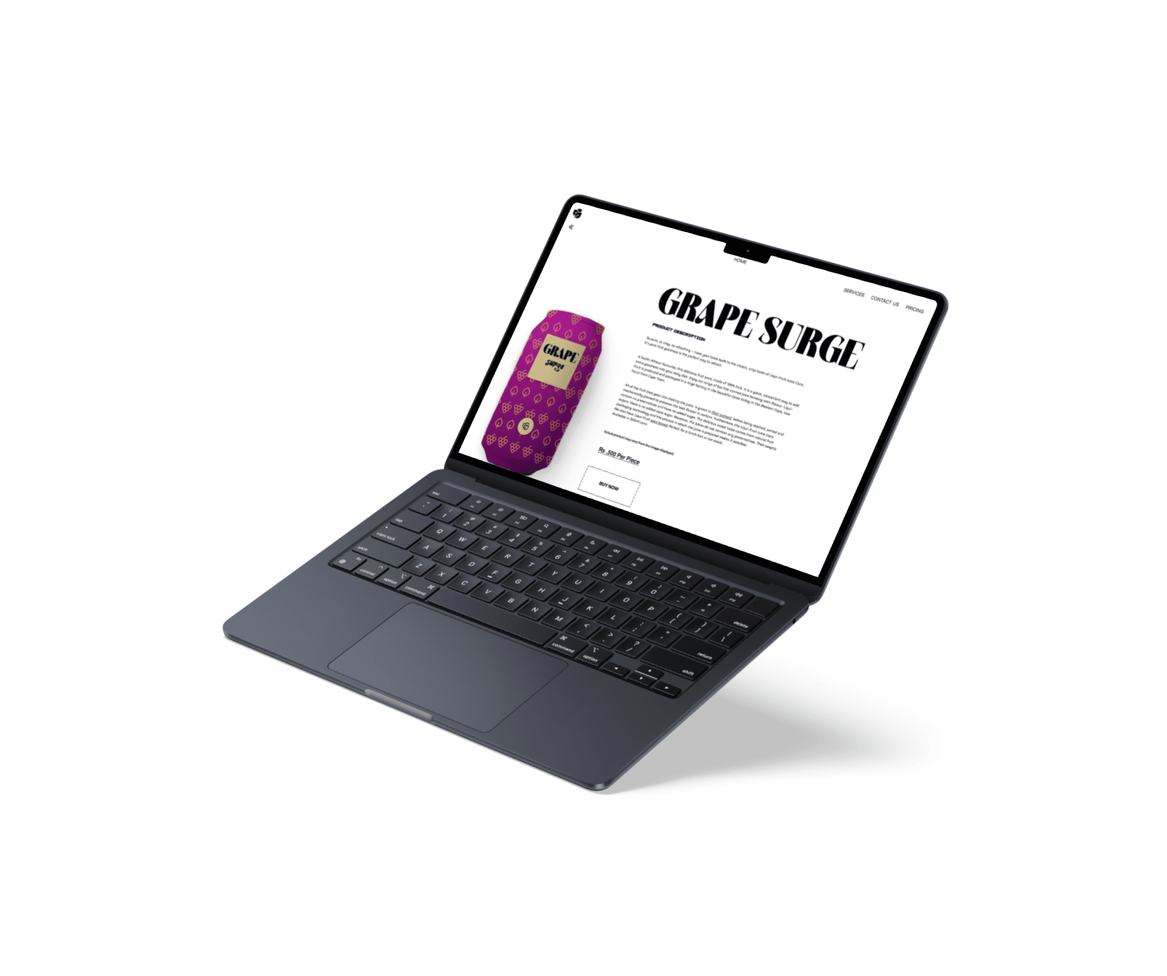
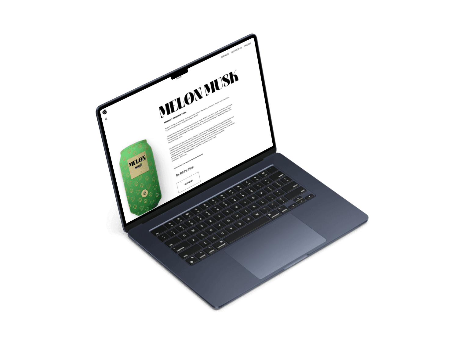
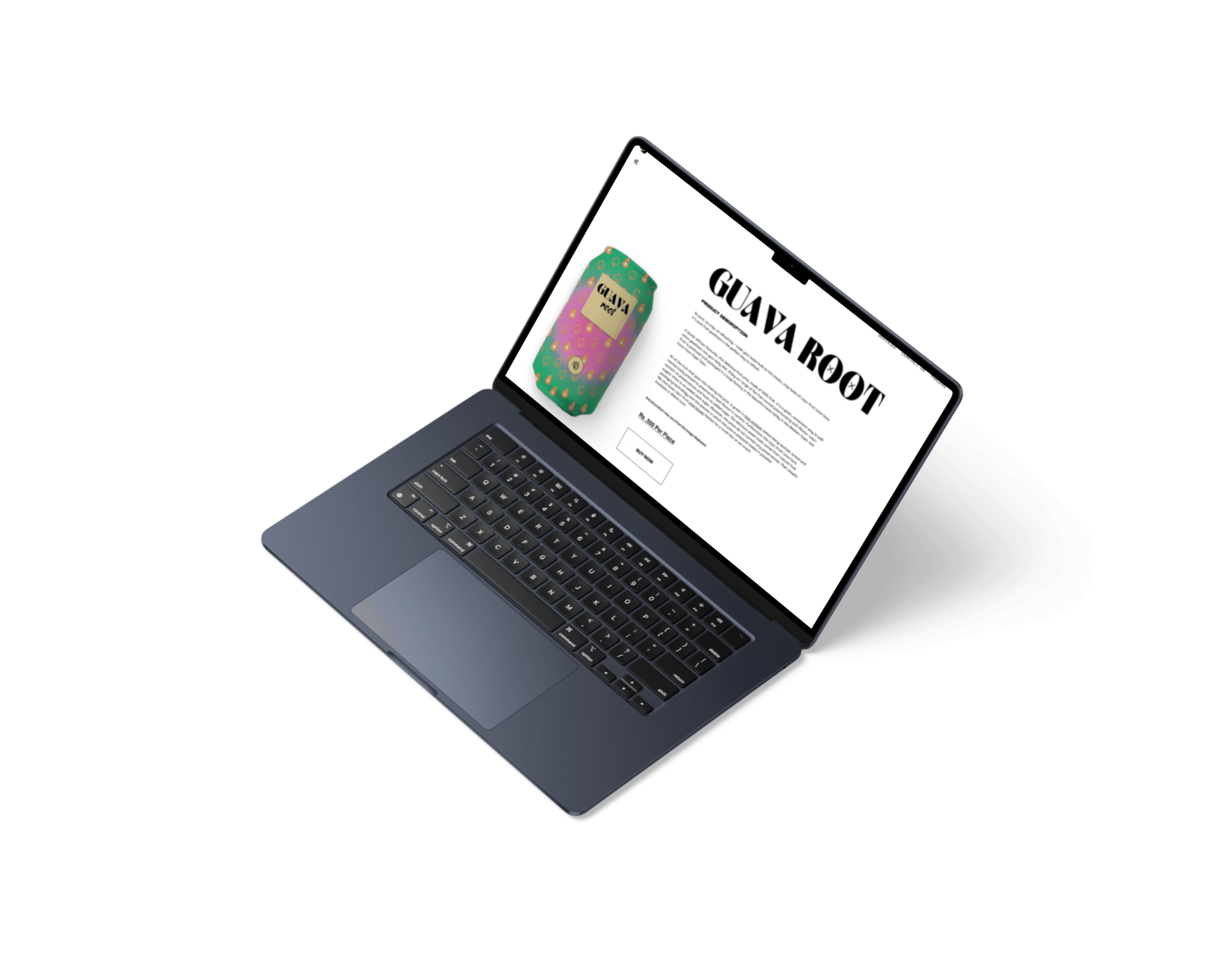
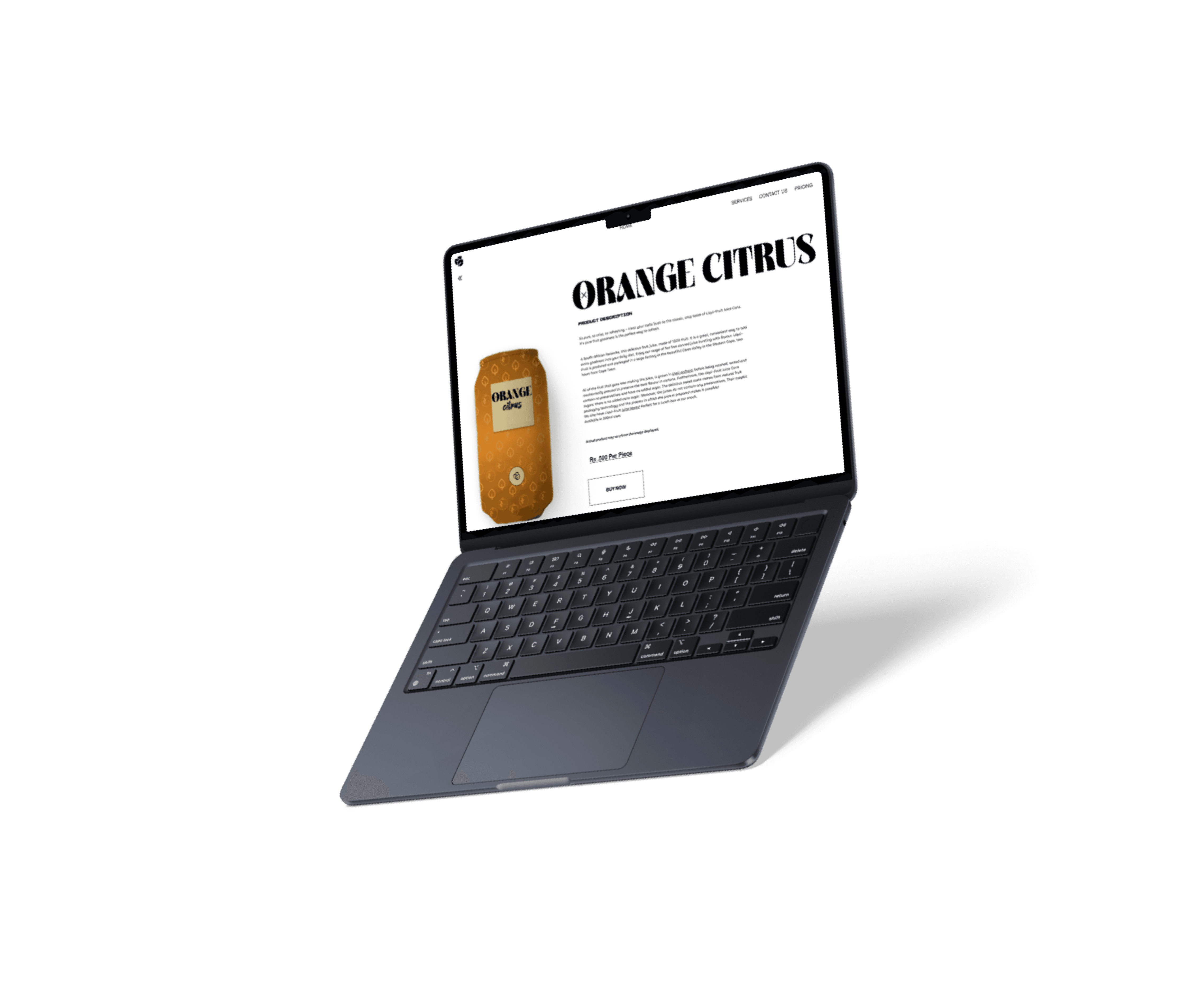
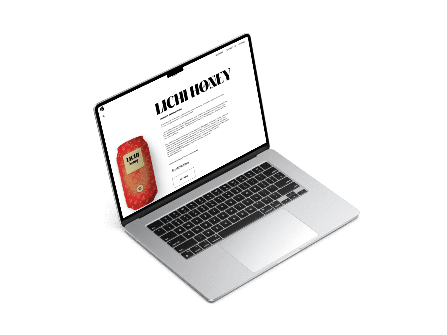
4. The Focused Product Detail Page
Once a user's interest is piqued, the design's objective shifts from exploration to conversion. This requires a shift from a "macro" view to a "micro" view.
Respecting the User's Intent: A click on a product is a clear signal of intent. The user is no longer browsing; they are actively evaluating. The design of the product page respects this by removing all peripheral distractions. The full-width layout is dedicated entirely to the selected product, creating a focused, uncluttered environment for decision-making.
The Power of Information Hierarchy and White Space: The page is structured to answer a user's questions in a logical sequence:
Visual: A large, crisp image confirms their selection and showcases the product's appeal.
Identity: The bold title immediately reassures them they are in the right place.
Details: The description provides the "why"—flavor notes, ingredients, and brand story.
Value: The price is presented clearly and without ambiguity.
Action: The "BUY NOW" CTA is visually distinct and placed at the end of the information flow, representing the logical next step. The generous use of white space is crucial here. It's an active element that prevents the page from feeling cramped, improves readability, and subconsciously communicates a sense of premium quality and calm.

Thoughtful Mobile Adaptation:
Possibility: The current design is desktop-focused. The next iteration would involve designing a mobile-first version. This is more than just stacking elements; it would require re-evaluating the scroll-triggered animations to ensure they feel just as fluid and intuitive on a touch interface without overwhelming the smaller screen or draining the battery. Some animations might be simplified, while others could be adapted to respond to swipe gestures.
Goal: To deliver the same high-quality, immersive brand experience to the majority of users who browse on mobile devices.
Breaking the Grid for Emotional Connection: A standard grid is efficient but can feel sterile and detached. By arranging the products in a dynamic, "floating" composition, the layout becomes playful and full of energy. This visual metaphor aligns perfectly with a brand centered on natural, vibrant fruit juices. It evokes a sense of abundance and fun, making the products feel more approachable and desirable.
3.1 detailed product view

Future Changes & Possibilities for Iteration
Even a strong concept has room for growth. If this project were to move into the next phase, I would explore the following opportunities:
Developing a "Build Your Own Pack" Feature:
Possibility: Introduce a new section or interactive module where users can drag and drop different flavors to create a custom multi-pack. This could be gamified, showing the virtual box filling up as they add cans.
Goal: To increase the Average Order Value (AOV), enhance user personalization, and create a strong foundation for a future subscription service ("Your Custom Pack, Delivered Monthly").
Integrating Social Proof and Community:
Possibility: Add a tastefully designed module that pulls in user-generated content from social media platforms like Instagram using a specific hashtag (e.g., #FruitPatchSip). This would showcase real customers enjoying the products in authentic settings.
Goal: To build social proof, foster a sense of community around the brand, and add a layer of authenticity that builds trust with new customers.
Accessibility and Performance Optimization:
Possibility: A critical next step for a real-world launch would be to ensure the design is both accessible and performant. This would involve:
Implementing a prefers-reduced-motion media query, which would disable or simplify animations for users who are sensitive to motion.
Thoroughly testing color contrasts to meet WCAG standards.
Optimizing animation files and website assets to ensure fast load times, even on slower connections.

Tools Used
UI/UX Design: Figma
Animation & Prototyping: Figma (for the interactive prototype).

6.Key Design Strengths
The success of the Fruit Patch design concept is built on several core strengths that work in harmony to create a cohesive and impactful user experience.
Narrative-Driven Engagement: The design's greatest strength is its use of "scrollytelling." It transforms the passive act of browsing into an active, cinematic journey. By choreographing animations with the user's scroll, the website tells a story, creates moments of delight, and holds user attention far more effectively than a static layout. This narrative approach builds a strong emotional connection to the brand.
Bold and Cohesive Visual Identity: The design establishes a powerful and memorable brand identity. The combination of a strong, elegant serif font for headings and a clean sans-serif for body copy creates a "modern-classic" feel. This is perfectly complemented by a minimalist color palette that allows the vibrant product colors to dominate, creating a direct visual link between the interface and the product's flavor.

7. Conclusion
This project successfully balanced brand storytelling with e-commerce functionality, proving an online store can be both beautiful and effective.
My key takeaway was the power of motion design in shaping user perception. By treating the user's scroll as a storytelling mechanic, we transformed a simple website into an immersive and memorable brand experience. The final design is not just visually appealing; it is a strategic tool crafted to engage users and drive business goals.
3. User Experience & Feature Analysis
3. User Experience & Feature Analysis

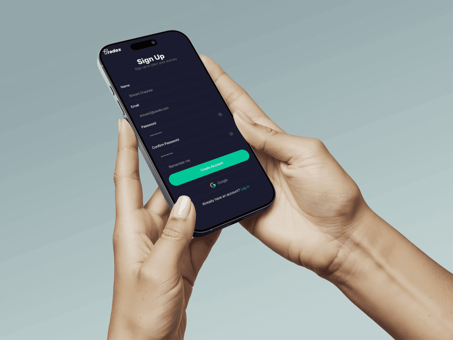
3.1 Onboarding & Setup
Sign-Up: The sign-up screen is straightforward and minimalist. It asks for essential information (Name, Email, Password) and provides clear input fields. The inclusion of a "Sign in with Google" option offers a valuable shortcut, reducing friction for new users.
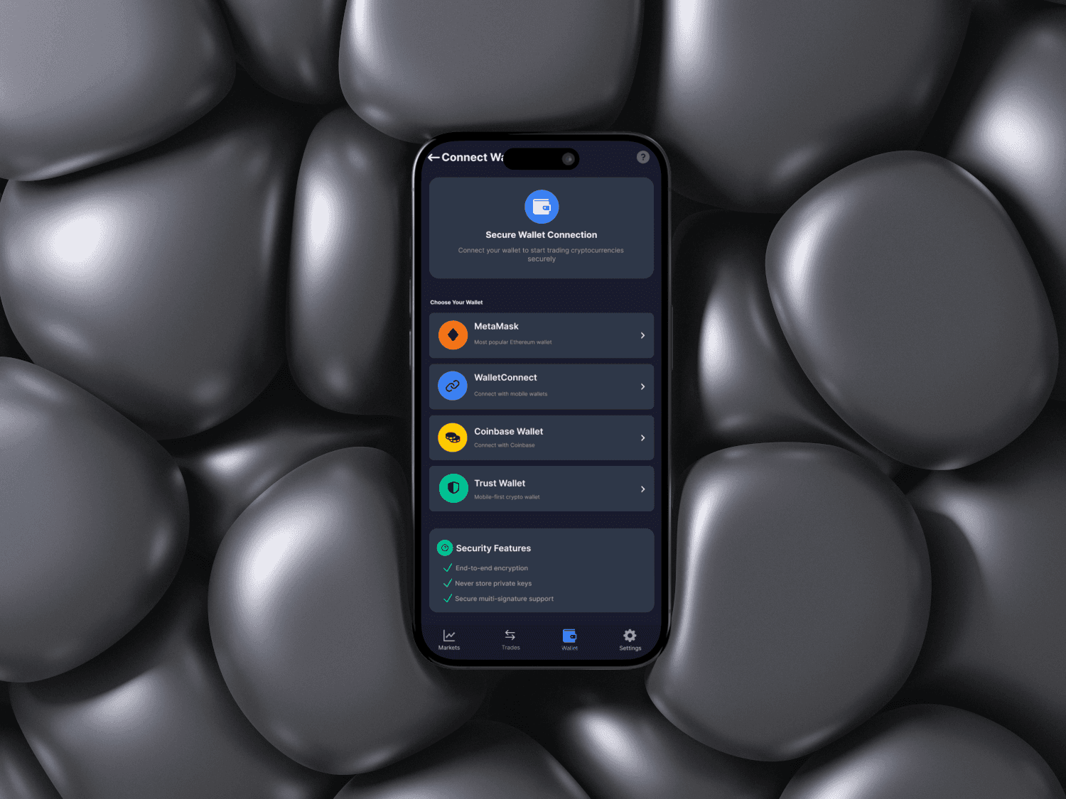
Wallet Connection: For crypto trading, the "Connect Wallet" screen is exceptionally well-designed. It lists popular third-party wallets (MetaMask, Coinbase Wallet, etc.) with their logos, making recognition easy. Crucially, it lists "Security Features" like end-to-end encryption, which builds user trust right from the start.
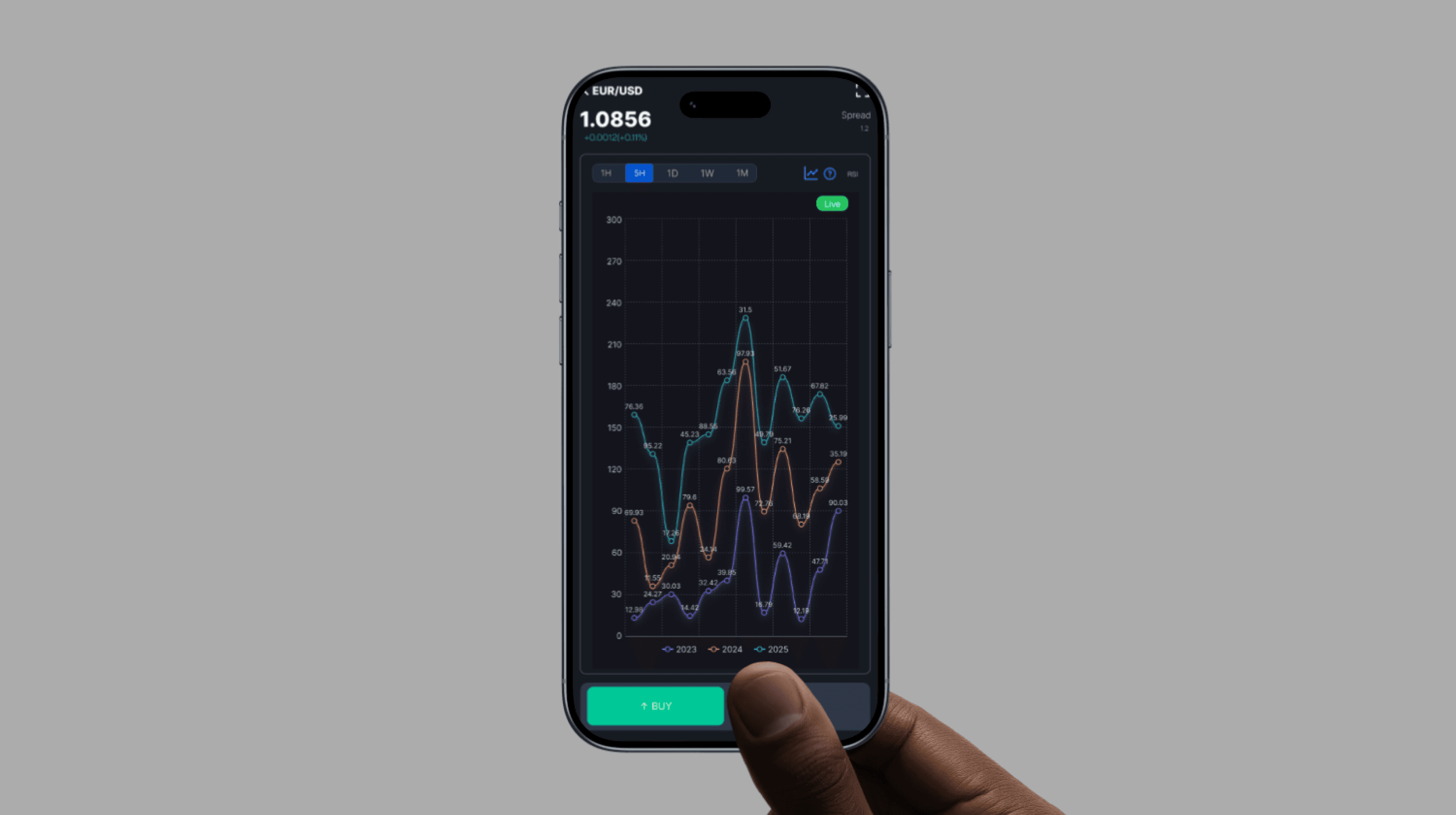
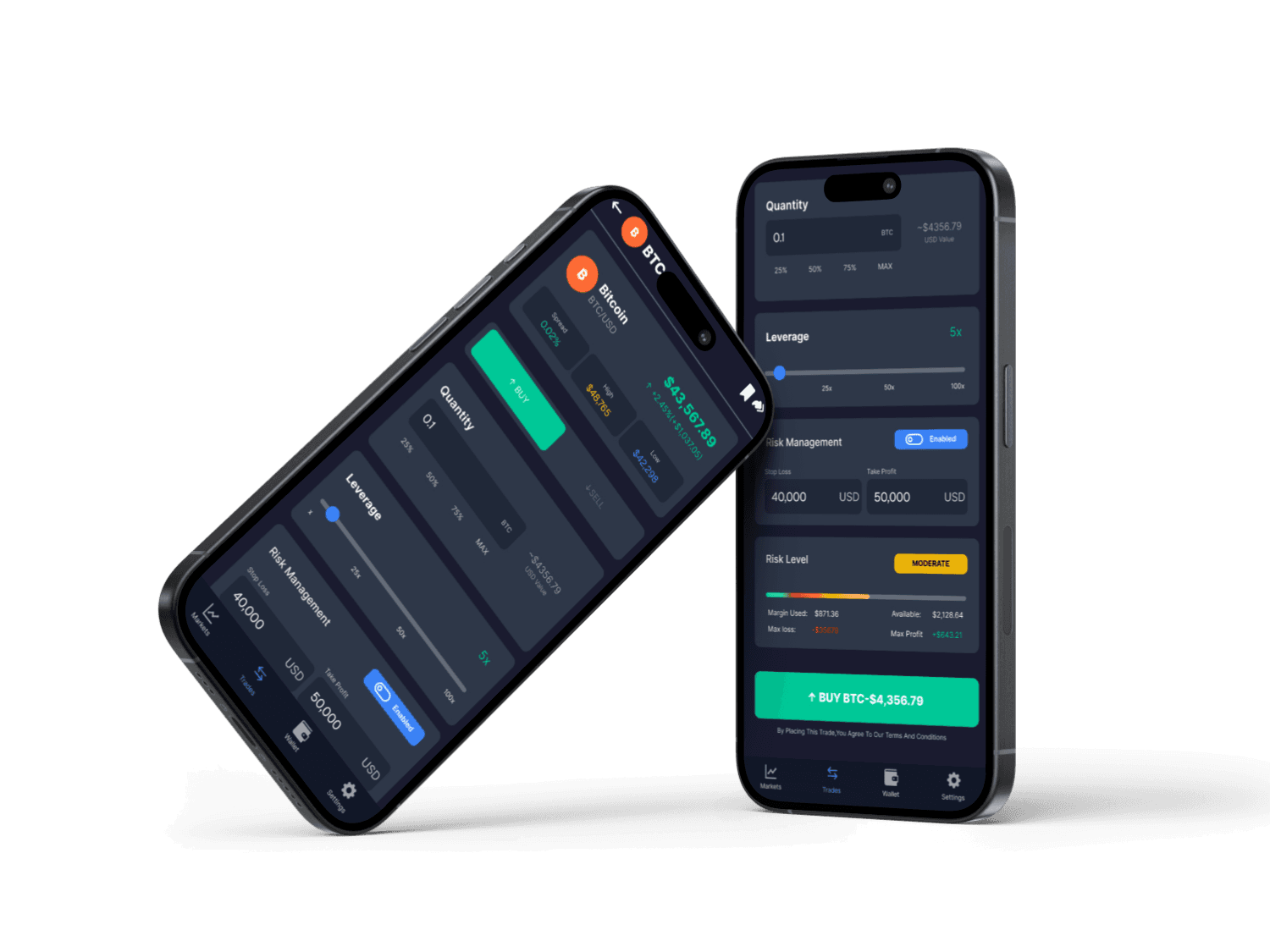
Tapping on an asset brings the user to a detailed screen with a large, interactive chart. The ability to switch between timeframes (1H, 5H, 1D, etc.) and view indicators like RSI is standard but well-executed. This screen is uncluttered, focusing the user's attention on analysis before making a trade.
3.1 detailed asset view
Risk Management: This is a standout feature. The dedicated "Risk Management" section and the visible "Risk Level" indicator (e.g., "MODERATE") actively inform the user about their potential exposure, promoting responsible trading. The final CTA button dynamically includes the action, asset, and price (e.g., "BUY EUR/USD - $1.086.79"), leaving no room for ambiguity.
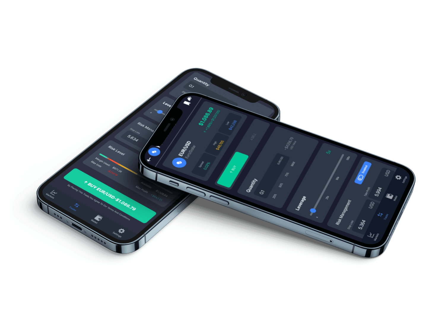
Trade Execution: This is the most critical flow, and the design is comprehensive and user-centric.
Clear Inputs: The fields for Quantity, Leverage, Stop Loss, and Take Profit are clearly laid out.
User Aids: The leverage slider and quantity percentage buttons (25%, 50%, 75%, MAX) help users make faster, more informed decisions.
3.2 Trade Execution

3.2 Core Trading Workflow
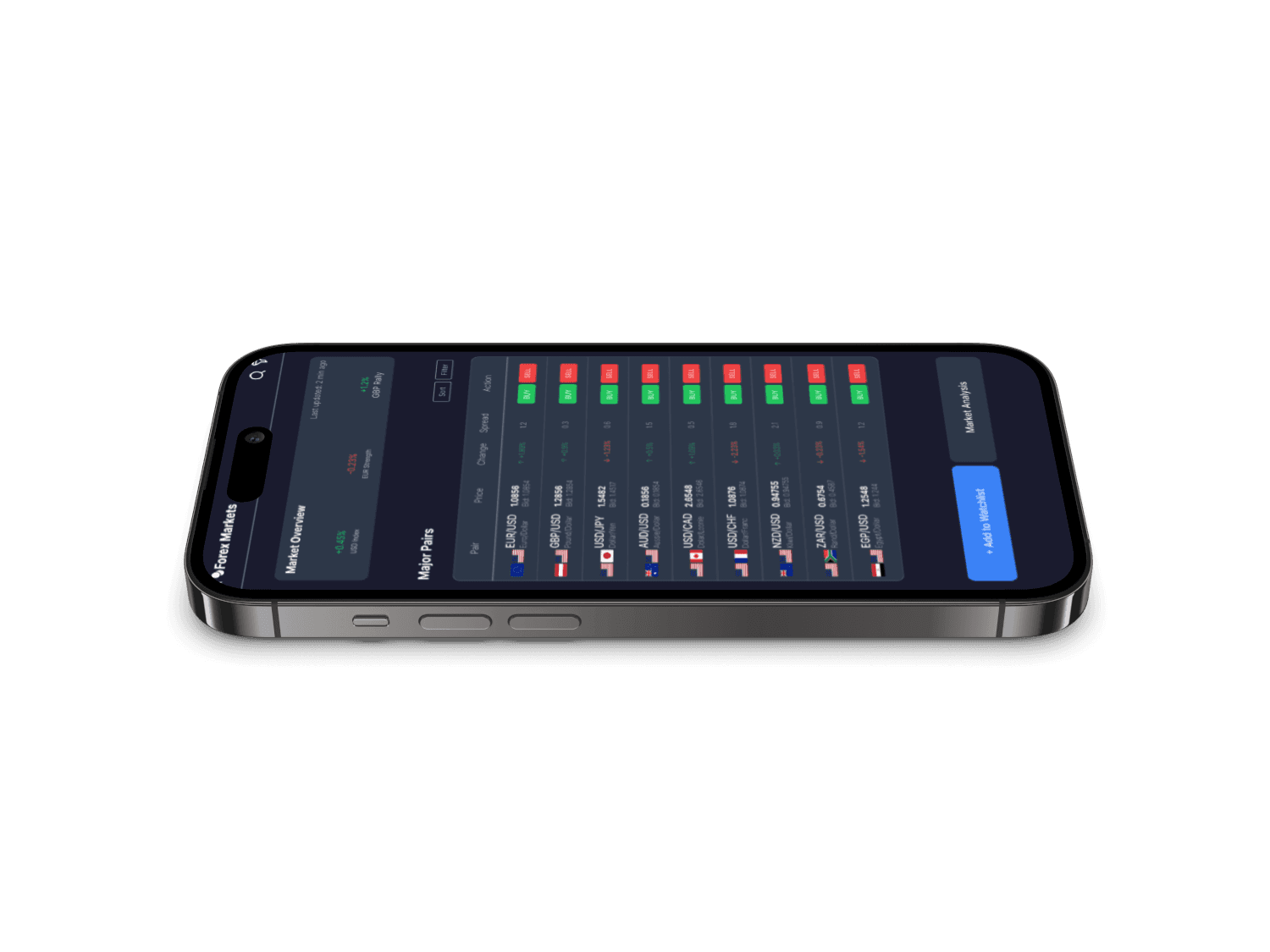
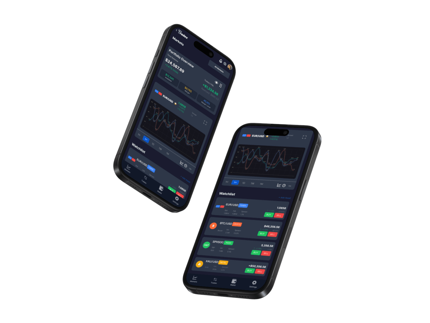
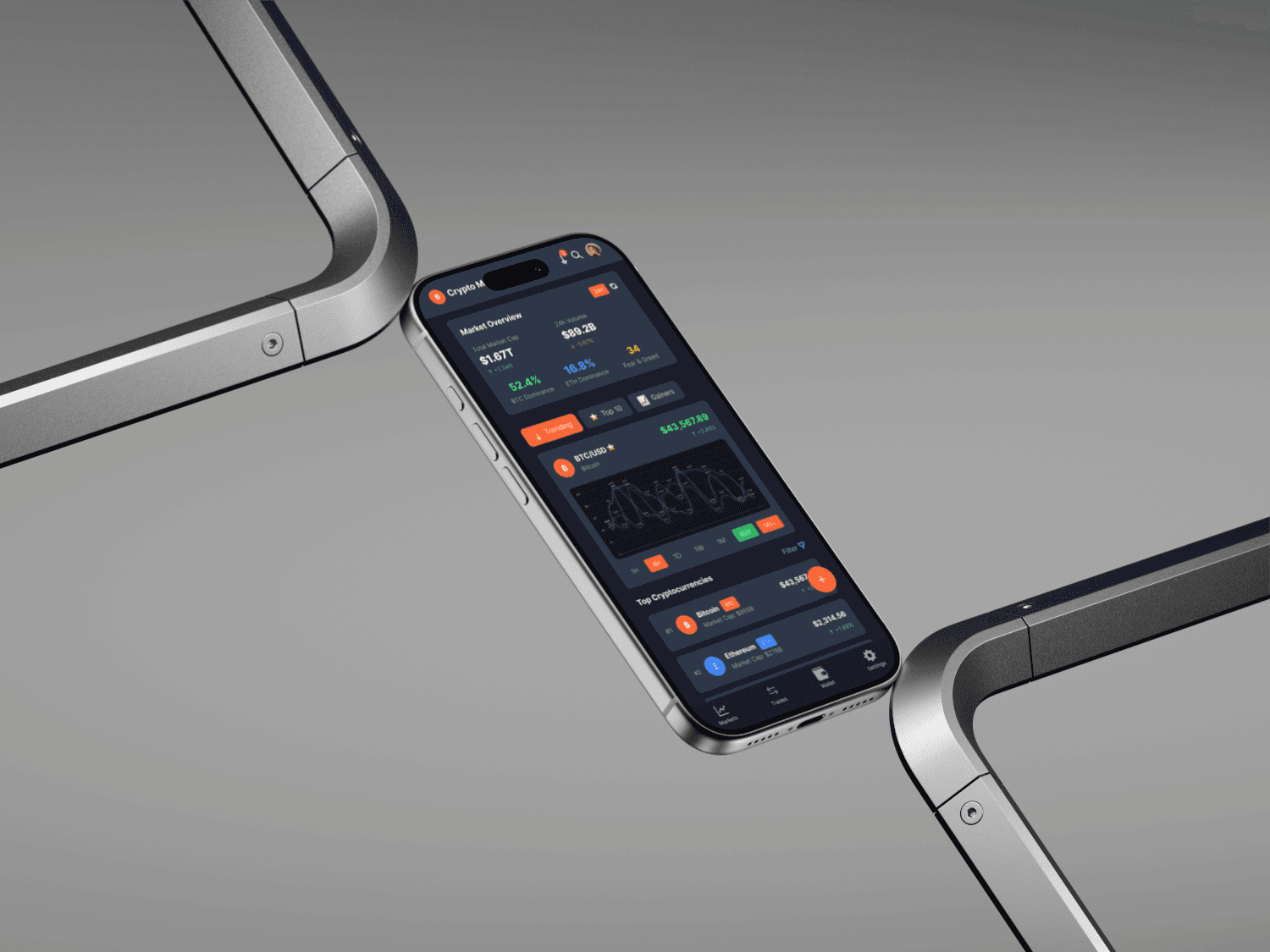
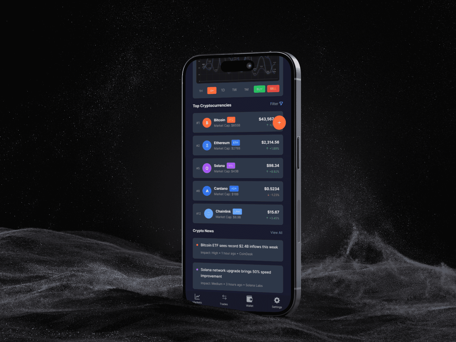
Dashboard & Markets Screen (Home): This screen serves as an excellent information hub.
Portfolio Overview: Placed at the top, it gives the user an immediate snapshot of their financial standing (Total Balance, Today's P&L, Margin).
Watchlist & Market Lists: The app provides clear, scannable lists for different asset classes (Forex, Crypto). Each list item efficiently displays the asset name, symbol, price, and percentage change. The prominent "Buy" and "Sell" buttons on the Forex list allow for quick action.
Data Visualization: The inclusion of mini-charts on the home screen provides at-a-glance trend information without needing to navigate to a detailed view.
Detailed Asset View: Tapping on an asset brings the user to a detailed screen with a large, interactive chart. The ability to switch between timeframes (1H, 5H, 1D, etc.) and view indicators like RSI is standard but well-executed. This screen is uncluttered, focusing the user's attention on analysis before making a trade.
Trade Execution: This is the most critical flow, and the design is comprehensive and user-centric.
Clear Inputs: The fields for Quantity, Leverage, Stop Loss, and Take Profit are clearly laid out.
User Aids: The leverage slider and quantity percentage buttons (25%, 50%, 75%, MAX) help users make faster, more informed decisions.
Risk Management: This is a standout feature. The dedicated "Risk Management" section and the visible "Risk Level" indicator (e.g., "MODERATE") actively inform the user about their potential exposure, promoting responsible trading. The final CTA button dynamically includes the action, asset, and price (e.g., "BUY EUR/USD - $1.086.79"), leaving no room for ambiguity.
Trade Execution: This is the most critical flow, and the design is comprehensive and user-centric.
Clear Inputs: The fields for Quantity, Leverage, Stop Loss, and Take Profit are clearly laid out.
User Aids: The leverage slider and quantity percentage buttons (25%, 50%, 75%, MAX) help users make faster, more informed decisions.
4 wallet integration and security

4. Wallet Integration and Security by Design
From the outset, we recognized that security and trust are the most critical components of a trading app. Our approach was to build security into the user experience from the ground up, making it feel seamless yet robust.
A cornerstone of this strategy was our decision regarding wallet functionality. Instead of building a proprietary wallet, which would require users to learn a new system and place immense trust in our platform alone, we chose to integrate with leading, established third-party wallets like MetaMask and Coinbase Wallet. This design choice offers two key benefits:
Leveraging Existing Trust: Users can connect the wallets they already know and trust, significantly lowering the barrier to entry and increasing their confidence in our platform.
Simplified User Experience: The connection process is familiar and straightforward for anyone already in the crypto space.
Throughout the wallet connection flow, we made it a priority to be transparent about the security measures in place. The UI clearly communicates features like end-to-end encryption, ensuring users feel informed and secure at every step of the onboarding process. This "Security by Design" approach was fundamental to making Tradex a platform users can feel safe using.
Focus on Information Hierarchy: We successfully organized a large amount of complex data in a digestible format, ensuring important figures are prominent and the interface remains clean.
Intuitive & User-Centric Workflow: We designed the journey from market analysis to trade execution to be logical and seamless, with thoughtfully integrated tools.
5.key design strengths
5. Key Design Strengths
Building Trust Through Design: From the professional visuals to the secure and transparent onboarding process, our design choices work together to build user confidence.
Clarity in Action: At every step, especially during a trade, the UI was designed to ensure the user knows exactly what they are doing, what the cost is, and what the risk is.

6. Future Roadmap & Next Steps
To further enhance the user experience, our future roadmap includes the following initiatives:
Integrated Educational Resources: To make the app more accessible to new traders, we plan to integrate tooltips and short tutorials on key concepts like leverage and risk management.
Dashboard Customization: We aim to give power users the ability to customize their dashboard by reordering or hiding modules to fit their specific needs.
Possibility: While the macro-animations are excellent, we could add a layer of polish with refined microinteractions. This could include subtle hover effects on buttons, interactive ingredient highlights on the product page (e.g., clicking a grape icon to see its origin), or implementing a 360-degree draggable view of the can.
Goal: To make the interface feel more tactile, responsive, and provide users with deeper, more engaging ways to interact with the products.
5.Future Changes & Possibilities
This case study provides a comprehensive UI/UX analysis of the "Tradex" mobile trading application, based on a series of provided screenshots. The objective is to evaluate the app's design, usability, and overall user experience from the perspective of both novice and experienced traders. The analysis will cover user flow, visual design, feature implementation, and identify key strengths and potential areas for improvement.
1. Introduction

The visual identity of a financial app is crucial for establishing trust and professionalism. Tradex employs a design language that is modern, clean, and data-centric.
Color Palette: The app utilizes a sophisticated dark theme, predominantly using deep blues and dark grays. This choice is effective as it reduces eye strain and creates a high-contrast backdrop for important data visualizations and figures.
Accent Colors: A clear and conventional color system is used: vibrant green signifies positive gains, buying actions, and profits, while red is used for losses and selling. Cool blues and yellows are used for highlights, toggles, and informational tags, creating a balanced and intuitive visual hierarchy.
Typography: A clean, sans-serif font is used throughout the app, ensuring high legibility for numerical data and text. A clear typographic hierarchy is established, with larger, bold fonts for key figures like account balances and prices, and smaller text for labels and secondary information.
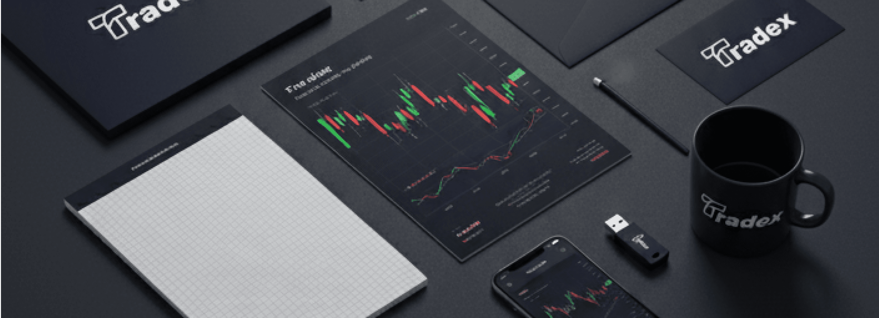
Iconography & Logo: The icons are modern, minimalist, and universally understandable. The bottom navigation bar features clear symbols for Markets, Trades, Wallet, and Settings. The "Tradex" logo, seen on the splash screen, is clean and dynamic, reinforcing a sense of a modern, tech-forward brand.
Overall Impression: The visual design of Tradex is professional, polished, and trustworthy. The clean layout, consistent branding, and strategic use of color instill a sense of control and seriousness, which is perfectly aligned with a financial trading platform.
2. Visual Design & Branding
7. Conclusion
With Tradex, we set out to build a trading application that is clear, efficient, and trustworthy. Through a user-centric design process, a logical information architecture, and a clean visual language, we created a platform that empowers traders. While initially geared towards intermediate users, our planned enhancements will make Tradex a top-tier choice for traders at all levels.
Enhanced Accessibility: We will develop a light theme alternative and ensure text sizes can be adjusted to improve readability and cater to a wider range of user preferences.
Advanced Filtering & Sorting: We plan to expand the filtering options in the market lists (e.g., sort by volume or volatility) to provide more powerful analysis tools.
Tradex Trading App
tradex is a modern app made to make your
crypto and online payments easy manageable and efficient.
Simplify your transactions—handle all your payments effortlessly at Tradex.
mobile app design : case study